How To Hang Drapery Panels

Purchasing and hanging drapery panels can be very overwhelming. There are a lot of little details that need to be considered, which we will talk about briefly in just a second. Most big box stores that offer curtain panels usually have them stocked at 84″ lengths or shorter, and if you are lucky, you may be able to order from their online stores up to 95″ lengths. But what if you have taller windows?

I have seen this happen so often on my in-home consultations. People usually move into a new home and are anxious to cover their windows whether for privacy or decorative reasons, so they run out to the big box store down the street to find an inexpensive solution. But is it really a solution if it is not addressing the problem? Store bought curtain panels rarely fit the windows properly. As I mentioned earlier, they are usually too short,  not many choices available, usually unlined or inadequately lined, and little or no consideration given to aesthetic and your energy savings needs. As I always say, you are going to spend the money anyway, why not spend it right. Custom drapery panels are made to fit your windows, and are a beautiful and timeless solution when done right.

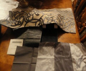
Here at No Naked Windows, we have made it easy to order custom drapery panels through our online store. You get to choose your fabric type (silk, faux silk, linen, cotton, burlap etc), your choice of solid or patterned fabric, your choice of header (the pleating at the top of the drapery panels), the finished length, type of lining, or even the choice of using two or three different fabrics for a color blocking effect. Visit our online store to see your options. They start at just $269 per pair!

Once you have determined that custom drapery panels are the way to go, you now need to know how to measure for them and how to hang them, which directly impacts the finished length to order. Measuring is simple – just measure from the floor to your desired height

Some additional tips for measuring:

The finished length is the actual length of the finished panels. To measure for the finished length of your custom drapery panels, simply measure from the floor to the desired height from where you want the panels to hang. A good rule of thumb is: If the space above your window is 8″ or less, it is usually more aesthetically pleasing to hang your drapery panels right at the ceiling. If the height is more than 8″ then you can determine how high above the window you would like to hang the panels. Please note if you have low ceilings hanging the panels closer to the ceiling gives the illusion of more height. One more thing to keep in mind is the hardware you will be using to hang your panels. The hardware will add approximately 1″-2″ to the overall length when hung. If you desire some puddling in your drapery panels, you can add 2-3″ for a trouser break look or 6-8″ for a formal puddled look. 

Here are a few illustrations of the Do’s and Don’ts of how to hang drapery panels

how to hang drapery panels


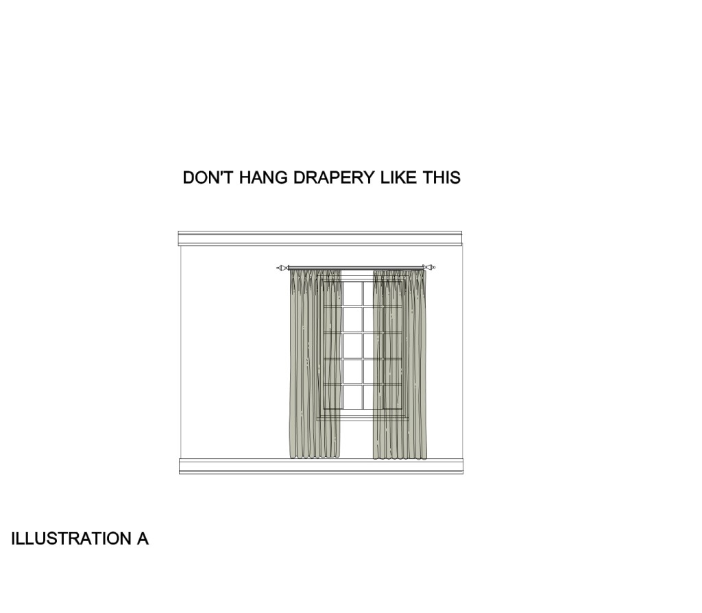
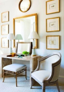
In this example there are  few don’ts:

  • Don’t hang the drapery panels right above the window. Hang drapery panels closer to the ceiling or crown molding to give he illusion of a higher ceiling
  • Don’t hang drapery panels so far above the floor. The minimum floor break is 1″. otherwise your drapery panels will look like high water pants
  • Don’t hang your drapery panels so far into the window. Hanging drapery panels starting at the edge of the window outward, helps to visually widen the window. Be careful that the edges of the window aren’t visible. Drapery panels should cover about 3-4″ of the window edges on either side. This applies to decorative drapery panels. If privacy is desired with your drapery panels, then you will need much more fabric for fullness, and room on either side of the window for stack-back ( The stacking back of the fabric when the drapery panels are in open position)

ILLUSTRATION B


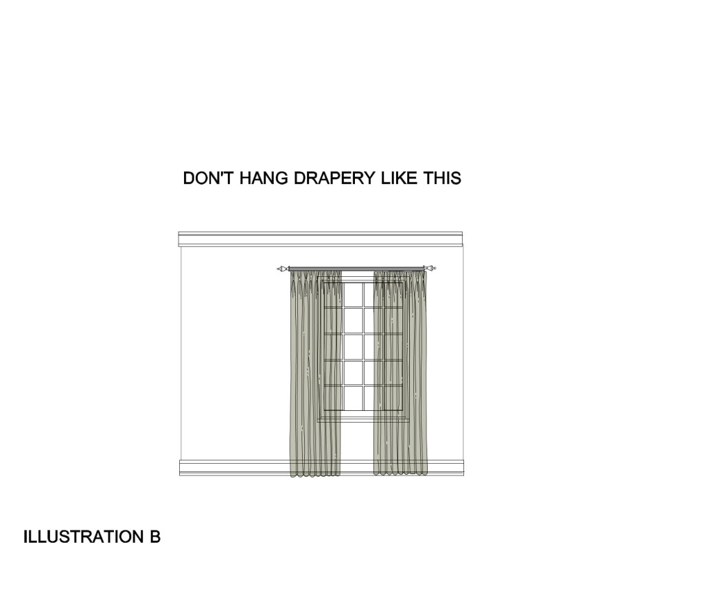
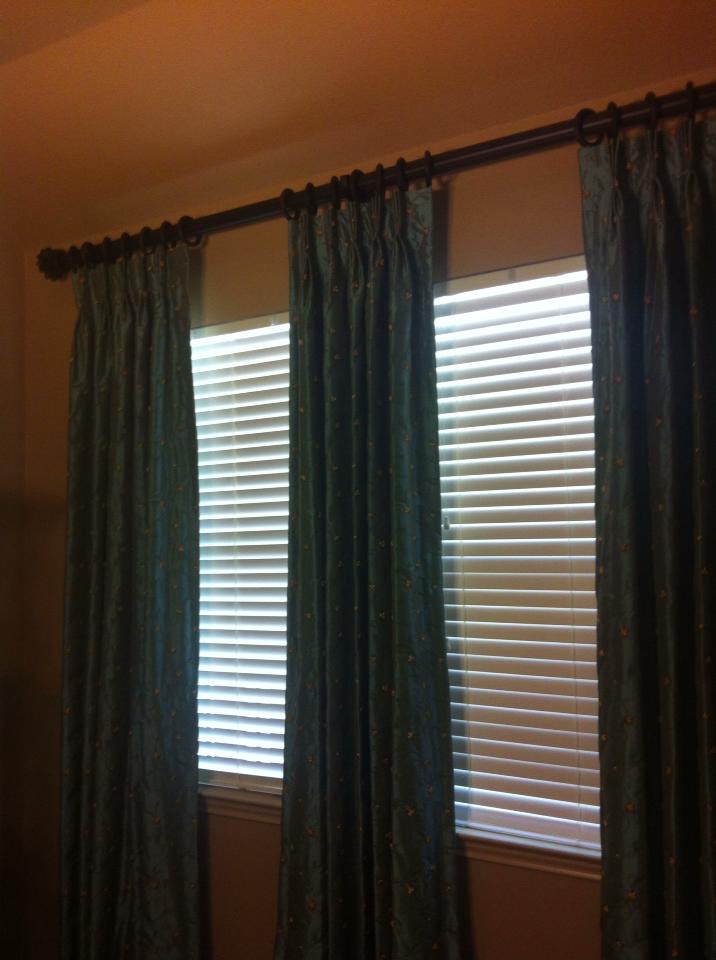
In this example, at least the drapery panels are touching the floor, but notice that they are still hung too close to the top of the window and the drapery panels are too far inside the window.

ILLUSTRATION C


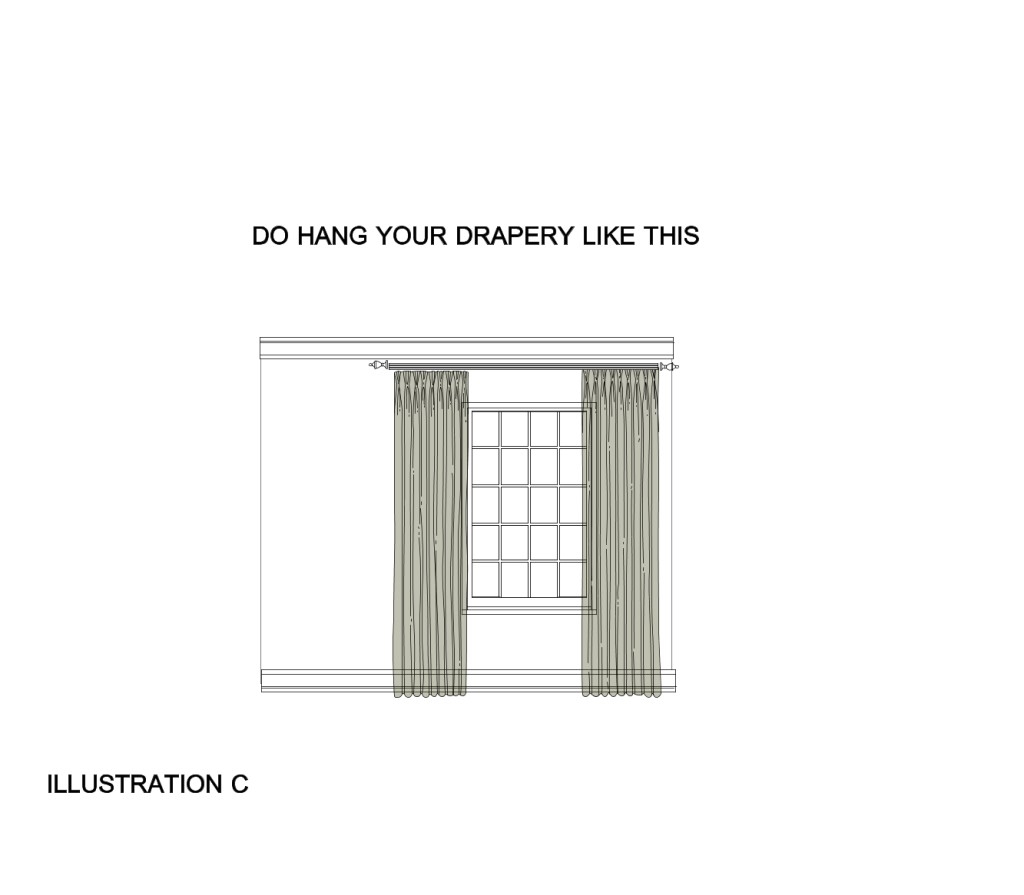
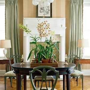
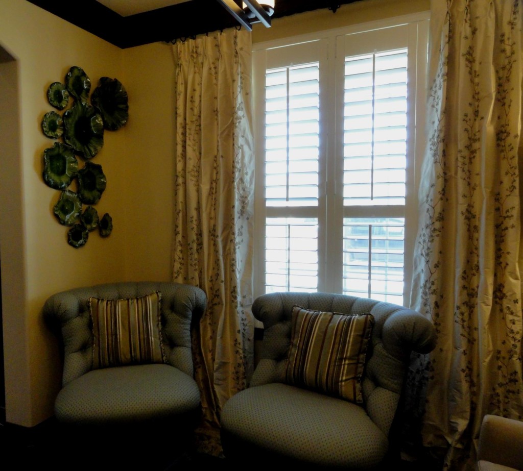
In this example, it’s finally done right:

  • The drapery panels are at a 1″ floor break
  • The drapery panels are hung closer to the ceiling
  • The drapery panels are hung at the window’s edges and outwards

I get this question a lot: What if I have double windows with drywall or trim in between both windows? Here’s the answer:

ILLUSTRATION  D


1813_553453858020937_2090014473_n


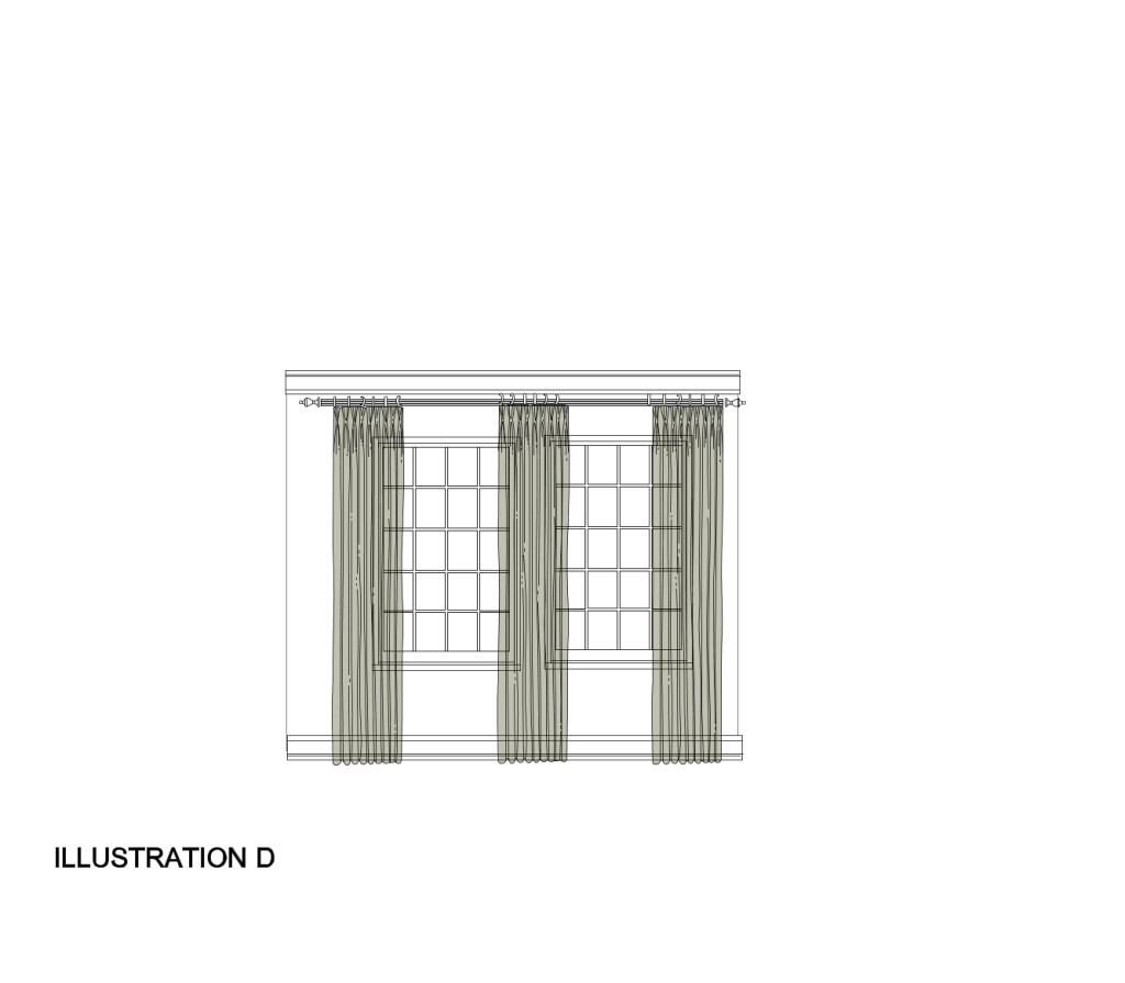
I recommend ordering a third drapery panel to cover the drywall between the two windows….especially if over 6″ wide. This helps the overall window treatment to flow better and look like one unit and be more cohesive. If you have beautiful wood trim casings around your windows that you wish to show off, then no need for the third panel, as long as there isn’t more than about 18″ between the two windows with casing included, in which case you may need to treat them as two separate windows with two drapery panels each.

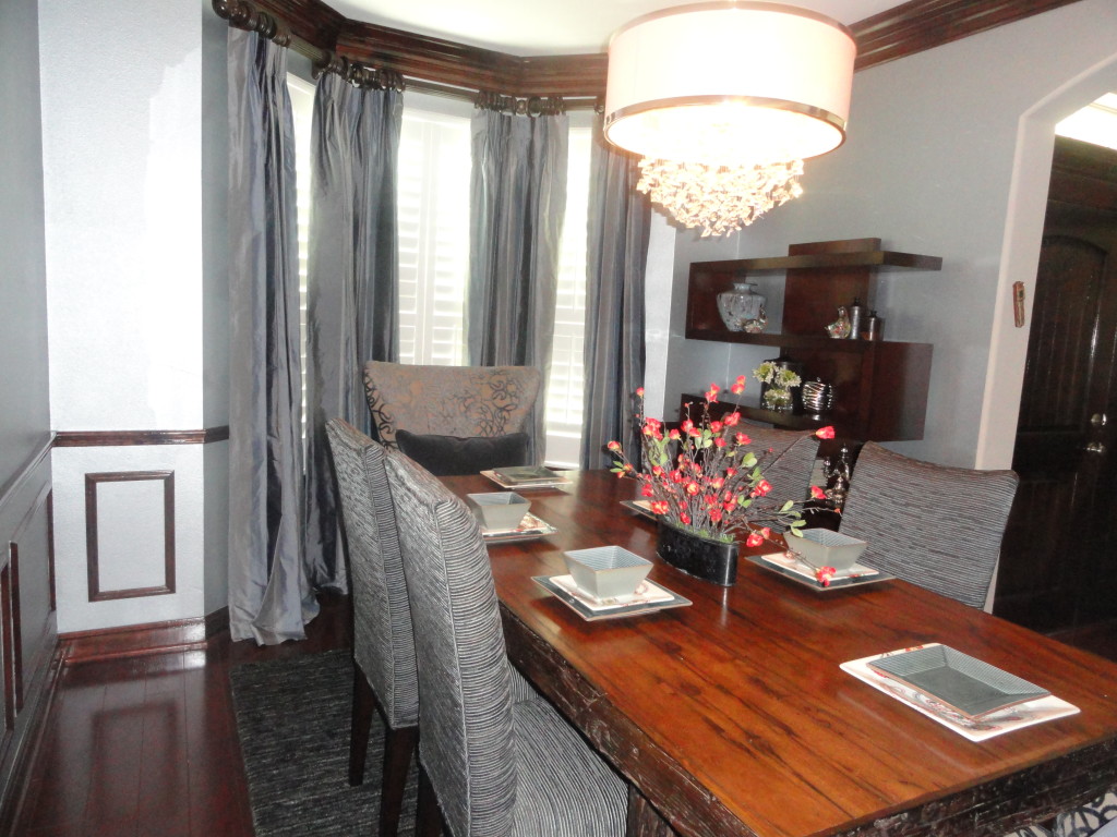
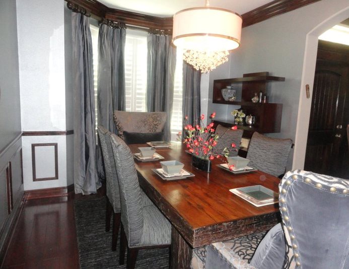
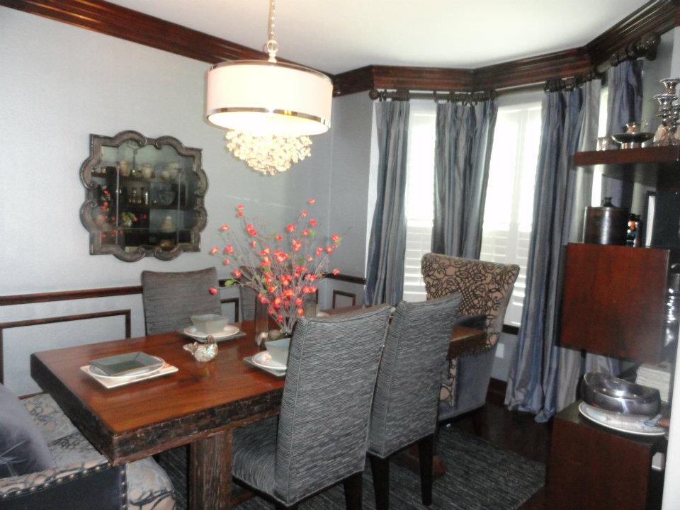
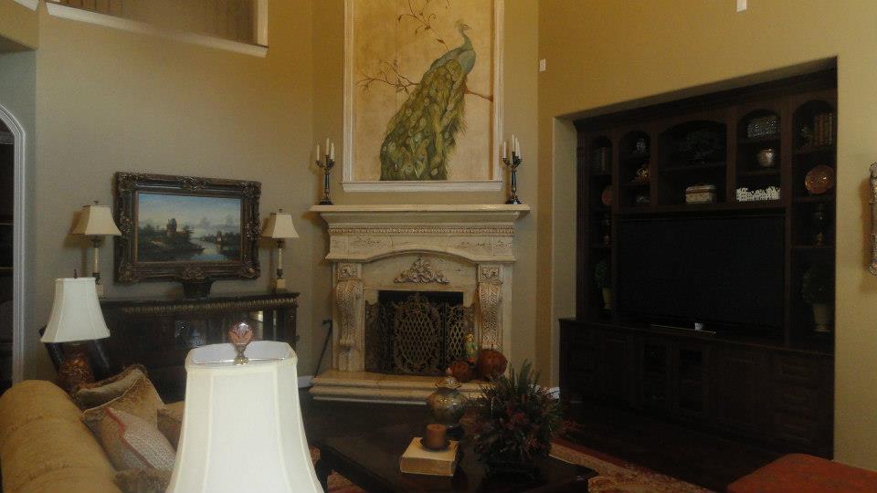
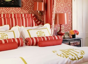
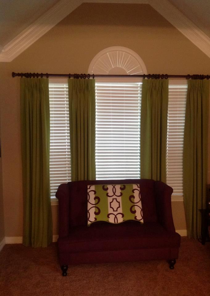
Here’s an example of drapery panels I designed and had installed for my client about two years ago. Notice that there wasn’t a lot of room above the window, so we took it all the way to the crown molding.

463358_378092702223721_110730298959964_1227720_1284562932_o

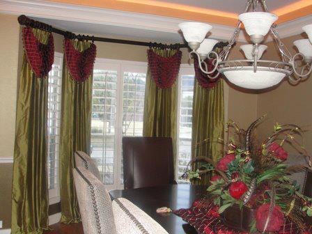
A couple more examples:

579086_631355073547965_65530747_n cropped


These are actually drapery panels with handkerchief swags. I included this picture to illustrate what happens when we are working with a bay window. You still want the windows to be one unit and have a cohesive flow. Here we used three different rods, but added a special hardware called an “elbow” to join them together at each 45 degree angle. The elbow is quite flexible and works much like our elbows do. The drapery panels are then installed to wrap around the angles for a better flow and cleaner look.

577978_627295687287237_534564411_n


So today you’ve learned how to measure your windows, where to order your custom drapery panels, and how to hang them. We will be running our summer special on custom drapery panels and all other window treatments starting June 1st through the entire summer – up to 20% off! You can use coupon code SUMMER20 at checkout beginning June1. If you are in the Houston area, lucky you! We can install your custom drapery panels for you at an additional charge, and even order your hardware for you! :-)

maybe you have some questions before ordering. You can contact me here and connect with me on all my social media channels.

Please don’t forget to comment and share! :-)

Be Inspired!

Veronica Solomon

Veronica Solomon


What DoThe BackStreet Boys Have To Do With Interior Design?

Recently I found myself humming to a song that I used to listen to over and over but hadn’t heard in a while. My 11 year old son Joshua, was a bit curious and asked what song I was “attempting” to sing. I replied “BackStreet Boys – Shape of My Heart”. His first response - ”Who are the BackStreet Boys?”. Of course I had to give him a bit of education on one of my all time favorite boy bands. That education of course started on YouTube, and from there we were rocking out to a bunch of their older and newer songs. He was hooked! Seriously! I think he is now the biggest BackStreet Boys fan! :-).

Why did I tell you about that story? Well it got me thinking about Interior Design (like everything else seems to. Inspiration comes from any and everywhere :-)) What always amazes me is how what’s old can become new again, and appreciated by a whole new generation. The BackStreet Boys’ careers may be extinct, but a brand new appreciation for their true talent has developed in my home, and will certainly be shared with friends at school and through social media. Who knows? Maybe there’s hope for the BackStreet Boys being the number one boy band again! :-)

Case in point – the watercolor trend for 2013. You can find watercolor patterns everywhere from the fashion runway, high end interior fabrics and furnishings to accessories. Click here to see a guest article I wrote recently for Refined Life Luxury Lifestyle Magazine about this trend.

watercolor trend

Watercolor pattern was really big in the 80′s! I recall as a young girl seeing the floral chintz fabrics in all their “beauty”. Sure, when an old trend is back en vogue, it is usually with some improvements and definitely more updated. These days, those watercolor patterns are done on some of the most beautiful linens and silks; not so much chintz anymore.

Another new trend is grasscloth wallcoverings, (and wallpaper itself). These were pretty popular back in the 70′s. These days, grasscloth is back and bigger than ever!

A Project I Completed 2 years Ago - Grasscloth Wallpaper on Main Wall

A Project I Completed 2 years Ago – Grasscloth Wallpaper on Main Wall

Grasscloth is one of my favorite wallpaper treatments. In fact, it will be on a few walls in my new home. I just love the wonderful natural and rich texture. The picture above is a project I completed about 2 years ago with grasscloth wallpaper on the main focal wall. It definitely adds depth and warmth to this space.

Another trend from a few years ago that is really hot these days is jewel tones, especially in fashion. Jewel tones are rich saturated colors inspired by gemstones like sapphire, emerald, ruby and amethyst.

Photo: Zillow Blog

Photo: Zillow Blog

These days, emerald green is the new color trend. In fact, it was named by Pantone as the color of the year for 2013 and can be seen in everything from fashion to furnishings to home accessories.

What was old is new again is certainly true for fashion. My daughter, who is a budding fashion designer has been very curious about what my style was like as a teenager and what the fashion was like back then. I am quite certain I will be the inspiration for a future runway collection from her ;-)

Well the Back Street Boys have nothing to do with interior design, but they are certainly a great example of something that was great in the past providing inspiration for the present. True art form never really dies – “everything old is new again”


il_fullxfull_320024246

What “old” idea or thing have you noticed is new again?

Now for the moment you’ve all been waiting for -  announcing the WINNER from my blog post contest than I posted over the long weekend “What’s Wrong With This Picture?” where you, my wonderful readers were asked to guess what’s wrong with this picture? The prize, of course, is a beautiful pair of 18×18 decorative throw pillows.

Before I get to the winner, I’ll tell you what was wrong with the picture: A few of you got it right – What was wrong is I had moving containers from two competing moving/storage companies! PODS and PackRat. Both were 12′ containers (although one looked slightly smaller to me). It is Quite a bit unusual, but believe me there is a long story behind it. Notice also that one container was even sitting at the curb instead of the driveway, which is deep enough to accommodate both. Moving is fun! NOT! :-)

Balloons_Winner_1

Ok, time for our WINNER:  Three…Two….One…..

Debbie Conner come on down!!!! You are the lucky winner of the fabulous pair of pillows!! Congratulations!!!! Please click here to send me a private message on Facebook to claim your prize :-) I am positive that you will enjoy them!

Thanks to everyone who participated!! :-)

Please remember to comment and share! :-)

Click here to contact me.

Be Inspired!

Veronica Solomon

Veronica Solomon


A Monochromatic Dining Room Makeover

Hello All! It’s already Wednesday! Can you believe the week has been racing by so fast? I’m still hard at work packing like crazy, and man, I am getting such a good workout!

Monochromatic Dining Room

Ok, so today’s post will be one of those short but sweet ones I mentioned in a previous article. The picture you are looking at is a project I completed about two years ago. This room belongs to some really awesome clients that I have been working with now for several years. I have done pretty much every room in their home – one project after another. In fact, I have 2 fans and a custom iron bed to install in the near future. I’ve seen them through marriage, 2 beautiful babies and one more on the way, the upcoming wedding of an older daughter, and many other moments in between. I think I’m a family member at this point, and they were a referral! (The power of referrals :-))

Ok, so back to the room……This I believe was project #4. They wanted a calm, serene dining room for when they entertain. They are a devout Jewish family, so alot of their meals and prayer time happen in this dining room. The room is very small…..the smallest dining room I have worked with, but they needed as much seating as possible and storage for prayer books. Tall order for a small room!

We decided on a monochromatic blue/gray color scheme. The walls were painted in a Ralph Lauren Regent Metallic and has a subtle, soft shimmer. My clients enjoy the juxtaposition of rustic with refined, so they were quite excited when I found the perfect size dining table, made from reclaimed wood in Indonesia. The side chairs were custom upholstered in a wonderful blue/gray fabric and the host/hostess chairs are actually occasional chairs turned dining chairs. They were also custom upholstered in two different fabrics for a unique and luxurious touch. The zig-zag bookshelf was the unexpected element in the room, and was the perfect size to fit that small space. And who can ignore the beautiful drapery panels, made from a luscious stripe silk fabric. Even better looking in person!

Fabric Selection For Dining Room

Fabric Selection For Dining Room

My favorite part…the fabric selection. My client loves fabrics as much as I do, and I always get to use the finest on her projects :-). She was completely in love with this beautiful selection of silks and silk blends, velvets, and cut velvets. Notice the beautiful textures?!

I also added an area rug and the beautiful crystal drum chandelier, and very minimal accessories – adding a pop of orange in the table setting. My clients and I were really excited about this room!

Here a couple more shots for your viewing pleasure.

monochromatic dining room


monochromatic dining room

Ok, so maybe this article again wasn’t so short, but I love to tell the story behind my projects. I am so fortunate to work with wonderful clients :-)

You too can become a client of Casa Vilora Interiors for your interior design needs and No Naked Windows if you’re interested in custom drapery and bedding. Contact me here!

Please don’t forget to comment and share :-D

Be Inspired!

Veronica Solomon

Veronica Solomon


Murals Instead Of Art

Hello All! Happy Monday! :-)

This week will be spent packing up my 4300 square foot home, deciding what to take with me to the much “cozier” home, what to donate to Katy Christian Ministries, and what to trash. I am being pretty ruthless with the trash pile. I’d say if there are any dumpster divers in my neighborhood, they are going to score big time!

My posts this week will probably be pretty short snippets; but short and sweet is good…right? ;-)

Please enjoy the before and after shots of the fireplace wall of a wonderful client I had the honor of working with late last year.

Before Shot Of Fireplace

Before Shot Of Fireplace

My clients just moved to Houston  and purchased a beautiful home with some great architectural features, but they were just a bit too plain for her as well as for me. She is an avid art collector with some very spectacular pieces that she had collected over the years. It is quite an impressive collection of beautiful framed oils of landscapes and architecture! She wanted the fireplace to be a focal point in the room while complementing the rest of the space. The fireplace is a cast stone, so it was much too blah for me, and with such high ceilings and the fact that the alcove was pretty much defined above the mantle, I didn’t think that a piece of art would be the best option. Besides we already had quite a few pieces of art in the room. I suggested we do a mural above the mantle and faux paint the fireplace surround to look like travertine or limestone….something more natural looking. She loved that idea!

After showing her a few ideas for the subject, we both fell in love with the beautiful peacock perched on a branch. My faux painter and muralist were very excited about this project, and so we set to work creating a masterpiece. I wanted the colors to be subtle and almost have an aged appearance, as if the mural was there for centuries – but still being very elegant and complementary to the updated traditional look of the rest of the space.

During

During

During

During

As you can see from the during shots, it was quite a big job that required scaffolding. My client later admitted to me that her husband would come home each evening and look at the unfinished work in progress, and was a bit nervous about the colors. Of course, she shared my vision from the very beginning, and did a great job of assuring him to just hang in there for the finished product.


After Shot Of The Fireplace

After Shot Of The Fireplace


Another After Shot Of Fireplace

Another After Shot Of Fireplace

Voila! This is the finished fireplace! You may notice that the actual fireplace surround was given a glaze treatment to age it just a bit (very subtle but a huge difference). We also added a glaze to the moldings that surround the art niche above the fireplace to make them blend in a bit more. It took a little less than 2 weeks to complete and is simply gorgeous…..expecially when seen in person! My client (husband included) were quite pleased  and very excited with the finished product. The entire room came together beautifully. Stay tuned for pictures of the rest of the room in future posts.

I guess this post isn’t so short after all ;-) but hope you enjoyed it!

If you would like a custom mural or paint treatment, or any help with your decor, you can contact me here.

Feel free to leave me a comment with your thoughts on the finished fireplace.

Be inspired!

Veronica Solomon

Veronica Solomon

Creating Pretty Vignettes

Foyer

376449_252535471516215_53036492_n


Creating pretty vignettes or groupings is one of the the easiest ways to add a designer touch in a room. Think of them as beautiful still life on top of shelves, tables, fireplace mantels, dressers, countertops, or any other flat surface that your heart desires. You can use accessories like mirrors, decorative boxes, greenery, floral, vases, urns, obelisks, photos, or any other personal belongings to create a mood or a feeling in the room. When your vignette includes items that have special meaning or sentimental value, it serves as a wonderful inspiration and conversation piece that is sure to make you smile whenever you enter the room. A vignette makes a room more pulled together and polished and reinforces the rooms color scheme and theme.

bettina-prentice-apt-lsd-03_130216622127

_MG_9184R


Whether your style is traditional, contemporary, shabby chic, transitional or an eclectic mix, you can create a pretty vignette to express your inner designer. Here are a few things to consider when styling a vignette.

60Handcrafted

3Foyers


  • Be sure that your vignette or grouping includes a light source, whether it is a lamp, sconces, candles or natural light. If your vignette is arranged in a dark corner, the effect will be lost.
  • Be sure that the objects selected suit the style and theme of the room in the way they are arranged. Symmetrical arrangements work best in a traditional room and an asymmetrical arrangement works best in a more casual room.
  • Choose colors that will complement the dominant color in the room. Florals are a great way to do this
  • Place several objects of similar shape, size and color together in odd numbers for maximum impact. Groups of three or five work particularly well and are stronger visually than a group of two or four

413320_450199391667532_2000164685_o

1be286ebf610c02a5d632fc17776317a

  •  Vary the heights of the objects being placed in your grouping. Use small pedestals to elevate items. Try stacking books to create a platform for smaller objects.
  • Stick to a theme (within reason) or like items… for example, adding a seashell to an arrangement of photos of a family beach vacation. Please avoid the temptation to overdo the theme. Subtle works best.
  • It is important to create depth in your arrangement. Instead of lining up items in a straight line, it is more visually appealing to place objects from the back of the flat surface to the front. Placing objects on top of a mirror, or leaning them against a mirror that’s on the wall, is an easy way to create a sense of dimension.
  • Vary the texture of the objects. Mix hard and shiny accessories with rough and natural. Use weathered wood or iron architectural elements to introduce an unexpected texture. Photo frames, which come in finishes from shiny enamel to beaded, offer an array of texture options
  • Your vignette is not restricted to just the table surface. The wall and floor  space around it is a part of the composition and need to be addressed as well

foyer-3ronbow2

Vignettes can be as simple or as complexed as you like, but the principles of proper scale, proportion, balance and rhythm need to be applied. You can start simple and layer on more objects as you feel more comfortable. Remember it is a great idea to use some objects that have some special meaning to you. After all, that’s what your home should be….all about you and your lifestyle.

Here are a few more vignettes for your viewing pleasure! Enjoy!

s-MEDITERRANEAN-HOUSE-PHOTOS-240x375eac1353bf228lovely-spaces-with-stripes-L-eiDHMr.blk rooms via e decor

Please don’t forget to comment and share! :-)

Be Inspired!

Veronica Solomon

Veronica Solomon

Quick Update On The New Home

Hello All! For those of you who have followed the progress of my big life change of downsizing my home at age 40, I thought I’d give you a quick update on how things are progressing. If you are interested in reading the previous articles I wrote about this, you can find them herehere and here.

The sale of my current “mansion” is still pending and should be closing escrow in two weeks. The new buyers are gracious enough to let us stay in the home for another two weeks until we close on our new home being built! What a relief to not have to move twice in one month! The new buyers are very excited to be be moving into this great home and community….they even already have mail coming here! :-) . I know they will be happy here just as we have been for the last seven years.

Ok so I know you all are ready to see some pictures, so without further ado, here goes!

photo (7)

photo (15)


It definitely looks like a family home now! the exterior has been completely painted and stained. Landscaping installed and the light fixtures (which will be replaced for sure) have been added. They actually forgot to add brick to the floor of the front porch, so that remains to be done. As you may be able to see, I do have electrical wires behind my home (not the junction box), but it was s small price to pay for not having back neighbors. I love neighbors as much as the next guy, but sometimes in the confines of my own home and backyard I do take “The Naked Decorator” thing literally! Just kidding…or not :-)

photo (13)

The cast stone fireplace has been installed. This is actually an upgrade from the one in my current home. I love the rough texture of this one, which will go very well with the updated country french direction for the new decor. Notice that my ceilings are low….I have 20 foot ceilings in my current home which was actually a great feature when I was buying the home. I wanted cozy instead of volumnous ceilings in this new home. I have a few tricks up my sleeve to make them appear just a tad bit higher…..but you will have to stay tuned for that :-). I plan to add hand-sawn faux wood beams to really play up the fireplace. Of course, the handscraped hardwood flooring will also be a nice feature when it is installed soon.

photo (12)

photo (14)

Kitchen cabinets are in! I wanted a lot of storage since this home is half the size of my current home. I plan to convert the big walk-in pantry behind the white door into a butler’s pantry with glass fronts for even more “pretty” storage. I went really dark with the cabinetry (which wasn’t my first choice) because the other choices in my budget range had red undertones (no more red!). These dark stained maple cabinets will be  a nice contrast to the white travertine backsplash and granite countertops and the rest of the decor, which will be in soft shades of grays and mossy greens….very cool color palette

photo (9)photo (10)

photo (16)

This is the smallish master bathroom (really filthy now, but that’s construction :-)). This bathroom is less than half the size of my current bathroom and I’m happy! Why? I don’t enjoy cleaning bathrooms! :-). My existing master bathroom has separate dual high-low vanities… I am single, so I just need one! No more jetted tub (I hardly use the one I have now), and now the wall tiles aren’t the 6×6 white ceramic tiles with a gazillion grout lines to clean! That’s definitely an upgrade :-)

photo (3)

This is the big compromise that we had to make here. This small bathroom will be shared by my daughter and son and guests (when we do have them). They now share a very large jack and jill bathroom, so at least they have a bit of privacy. There is also a separate guest bathroom (that never gets used but somehow always ends up dirty :-)), and a powder room. My daughter was really looking forward to her own bathroom, but oh well, she’ll live! :-)

There is so much left to be done, and I am actually a bit worried that they will not make the deadline of end of month. Fingers….and toes crossed please?! :-)

We are definitely looking forward to the move. I am especially happy that with this move, in about 10 years….maybe eight if I stop buying shoes :-), I will be completely financially free, mortgage included. Downsizing is definitely worth that!!

Thanks for reading my story….as boring as it is :-)

Please don’t forget to leave a comment. I’d love to hear what you think about the “quick” update on the new digs!

Be Inspired!

Veronica Solomon

Veronica Solomon


Hardwood vs Composite Wood Shutters

California, Wooden, Plantation Shutters – whatever you want to call them, they are a stunning addition to windows.

Round-Top-Wood-Window-Shutters


Windows are considered the eyes of your home. Just as it is important to pick the right style of windows for your home, it is just as important to consider how you will dress those windows.

Shutters are a cost-effective way to add beauty and value to your home. They are great for controlling light, ventilation and privacy. They form a wonderful first layer of privacy when dressing a window. Draperies and other soft window treatments can be added to soften the look of your shutters if desired, which adds and even richer more luxurious touch. Great looking and quality made shutters become an architectural element to  your home, which may add resale value. While the upfront cost of shutters may be more than blinds and other types of hard treatments, shutters are more durable, timeless and a better value for your home for the long term.

Although shutters were originall used for exteriors to help cool down the home in warmer climates, they have definitely moved indoors and are in high demand now-a-days.

Shutters are manufactured with different types of materials – the most common being solid wood and composite wood. How can you determine which is better for your windows? Here is  a list of pros and Cons for each type of shutter.

resizer


Solid Wood Shutters

Solid wood painted shutters are the lightest in weight which helps in operation.  Solid wood shutters are typically around half the weight of their composite counterparts.
• Solid wood painted shutters are available in any finish.  From white to black and everywhere in-between.
• Solid wood painted (and stained) shutters are the longest lasting shutters.  In many applications, solid wood shutters will offer good service for decades.  Often, solid wood shutters will last as long as the house.
• Solid wood shutters have the most solid feel.  The natural ridged materials of wood provide solid, twist free operation when opening and closing.
• Solid wood shutters are available in the widest array of sizes.  Wider panels, taller panels and panels without additional support components (such as divider rails) are available in solid wood.
• Solid wood shutters are available in a variety of shapes – arched, round etc

Wood does however have a few cons.

• Solid wood painted shutters are not recommended in areas where the shutters are going to be subject to direct and repetitive contact with water.  Not the occasional steam in a bathroom but rather direct water drops you would find in a bathroom shower surround or glass-less window.  Even though the wood itself is perfectly suited for high water areas, the fact that wood swells to absorb and then contracts as it expels water, the paint on top of the wood cannot expand and contract as well.  Paint will chip and peal when used in the incorrect environment.
• Wood takes longer to construct.  There is a large amount of hand finishing and multiple construction steps associated with solid wood shutters.  Typical wood shutters can take anywhere from four to eight (or more in certain specialty applications) to construct.

Solid wood stained shutters.

• Stained shutters offer all the same pros and cons as their painted counterparts with the exception that stained shutters come in stained finishes.  With stained shutters, various woods can be used including basswood, maple, poplar, oak, cherry, maple, mahogany, and teak (which is an environmentally friendly option). Although specialty woods add to the cost of shutters, nothing provides a perfect color, finish and feel than an exact wood species match when appropriate.  Stained shutters are most expensive than painted shutters.


Shutters-beneath-drapery-panels1


Composite shutters.

Composite shutters are produced more quickly than wood shutters. Composite shutters can be made within two to three weeks in most applications.
Composite shutters are impervious to water making them the perfect choice for shower and bath surrounds and windows without glass.

Composite shutter cons.

• Composite shutters are heavier than solid wood shutters.
• Composite shutters are not as stiff as their solid wood counter parts.  Materials such as wood and aluminum are often added inside of the composite parts to help stiffen and support composite shutters.
• Composite shutters require divider rails, center frame posts and are limited in panel width and configurations due to weight and stiffness restrictions.
• Composite shutters are available in solid colors only.  Since there is not a “grain” in composite materials, there would not be a reason to stain the material.  In addition, the process of staining requires an absorbent material to adhere the finish.  Composite materials do not provide this material characteristic.

thomasville-1


Interior shutters are a wonderful investment to any home. The quality of construction will vary from company to company, so a bit of research should be done before selecting a company for your shutters. Casa Vilora Interiors and No Naked Windows offer a wonderful range through Hunter Douglas and Norman. You can click here to send us an email with any questions.

Please don’t forget to comment and share! :-)

Be Inspired!

Veronica Solomon

Veronica Solomon


Why We Love Monogramming

2c2242888b006f9b0716b634553cd249

I was recently invited to a wedding and labored over what to get the couple for a wedding present. Of course I could have made it easy on myself and used the gift registry, but I wanted to make it a bit more special, and something that they would still enjoy many years from now. Being a designer, I wanted something that would add some beauty to their home, but also something that was useable and functional. After doing a bit of clicking around on the World Wide Web, I came across Pottery Barn’s Monogramming and Personalization webpage. of course I have seen monogrammed linens, bedding and robes several times, but hadn’t thought of that as a possibility. As I read further, I began to learn about the history and saw all the amazing options available. I decided to go this route.

monogram_group_pear_lg_1-500x394

cat1-428x244

new_hm2m

new_hm3mn


Monogramming lends a classic, personal touch to everything from towels to bedding. A tradition dating back six centuries. Today monogrammed linen remains widely popular and gives a feel of luxury and importance to bedding, linen or personal effects making them a perfect choice for gifts and wedding mementos. Monogramming is a great way to personalize a piece like a jewelry box or tea-light holder, making them instant heirlooms.

Pottery Barn has a wonderful web page that does a great job of explaining the history of monogramming. It’s worth a read!

new_hm1

A cozy robe or plush towels become as personal as they are pampering with the simple addition of a monogram. Bedding takes on a crisp, tailored appeal that adds refinement to a room’s decor. Even non-traditional items like soaps and storage jars, when monogrammed, lend a gracious touch to a bathroom.

linens - house beautiful


I enjoy seeing monogrammed bedding and linens in decor, because not only does it bring classic refinement to the room, but a wonderful touch of luxury.

whimsical41

stool

If you enjoy the classic look of monogramming, find an item that has some sentimental value and have it mongrammed with your initials, or those of your spouse and children. It is one of those pieces that will be treasured for many years to come.

What is one item you own that has some wonderful memories or sentimental value? Do tell.

Thanks for reading and please don’t forget to comment and share :-)


Be Inspired!

Veronica Solomon

Veronica Solomon

Why We Love Fiddle Leaf Fig Trees

fiddle leaf fig indoor plant living room art modern 2

I am admittedly a houseplant serial killer, but lately I have been coveting these fiddle leaf fig trees. I love the sculptural effect and height that they bring to a room. It is always a plus to bring a bit of greenery into every well decorated space.

imagesCAE0MS8S


Have you noticed that they seem to pop up in every shelter magazine spread and design blogs? There’s a reason they are so popular. Fiddle leaf fig trees are almost like natures’s sculptures. They are big and bold, and a breath of fresh air. What’s not to love!

Fiddle leaf DC Design House

Fiddle leaf fig trees are commonlly used as indoor potted plants. They are relatively easy to care for and have a slow growth rate. If you love the fiddle leaf fig tree as much as I do, and plan to own one or two, pay close attention to these maintenace tips:

  1. Make sure your plant has right amount of light. Abundant but not direct light is
    recommended. Too little light will cause the plant to lose leaves and thin out.
    It also tends to grow towards the light giving the impression that it is
    leaning. Rotate the plant every so often to keep it growing straight and to
    ensure bushyness.
  2. Don´t over water the plant. The Fiddle leaf fig does well with
    short dry periods between waterings. The frequency of watering depends on the
    amount of light the plant gets. One good way to determine how often you should
    water is to let the pot dry out until the new growth at the top begins to wilt
    slightly. Calculate the time that elapsed from the last watering and subtract a
    day or two to determine the ideal frequency of watering. This way you will be
    watering the plant just before it starts to wilt the next time.
  3. Prune to encourage branching and bushyness. The Fiddle leaf fig tends to grow a
    tall single stem when indoors. This long stem will normally not be able to keep
    itself upright and will require some sort of support. To encourage a more “tree-like” form prune the plant at a desirable height while the plant is still fairly
    young. It is recommended to do this in early spring before the new growth
    forms.
  4. Be careful not to expose the plant to dry heat or drafts. Like other Ficus tree plants the Fiddle leaf fig has a tendency to drop its leaves when exposed to too much dry heat or drafts and go into a sort of dormant recovery mode for a period of time.
  5. Clean the dust off the leaves once in a while to allow the plant to absorb as
    much light as possible. Often in indoor settings a layer of dust builds up on
    the leaves without us being aware of it, and that reduces the effective light that
    the plant gets. Every so often gently clean the leaves off with a soft cloth.
    Don´t try to do this with your hands as rubbing the leaves can damage them
    slightly and cause them to bleed little drops of white milky sap. Use latex
    gloves if you are allergic to this plant.
  6. Move your plant to an outdoor setting during the summer so that it can get more light. If you do this however, transition it back indoors gradually at the end of the summer to avoid shocking the plant.
  7. Trim the roots every year or two. The Fiddle Leaf Fig is a tree capable of growing 40-50 feet tall with a normal root system for a tree that size. When roots grow
    in a small container they have little room to grow in and end up wrapping around
    the base of the container or growing out the bottom of the pot. Trimming the
    root system back during the dormant season will help keep the plant growth slow
    and will help maintain healthy roots.

IMG_2883a640

18208_TG26285

contemporary-living-room


If a live fiddle leaf fig tree is not your thing, there are definitely faux alternatives that look so much like the real thing…….and are maintenance free!

3T2161-769-8_large


This faux fiddle leaf fig tree is from Natural Decorations Inc

T-12-194-563

This faux fiddle leaf fig tree is from Lux Art Silks. Can you tell the difference?

So what is your thought on this tree trend? LOVE it or LEAVE it? I know what my choice is! :-)

Thanks for reading. Please don’t forget to comment and share this post if you found these tips and information useful!

Have a fabulous weekend! And maybe pay a visit to the garden center to pick out your very own fiddle leaf fig tree! :-)

Be Inspired!

Veronica Solomon

Veronica Solomon


An Education In Area Rugs-Part II

By now you guys are experts in choosing the right color, material and construction of your area rug….right? :-)

As I mentioned in Part I of this two part article, choosing the right size area rug is the biggest mistake people make. Choosing the proper size is essential to filling the space properly and making the rug look the best it can in your home.

Here are a few scenarios with illustrations outling the best ways to determine the size rug you need for your space.

Illustration 1

myimage


In this illustration the room is  a large 16′x20′. Notice that all the furniture pieces are anchored on the rug. This creates a unifying feel and anchors the conversation grouping. You may even be able to accommodate a couple of conversation groupings. You always want to make sure all furniture pieces are sitting on the rug – even just the front two legs. otherwise the rug will seem to float in the room (I call it the magic carpet ride :-)). A 10′x13′ size rug was used in this example.

Illustration 2

myimage


In this illustration – A room-sized rug where the furniture floats center. A 10′x13′ or larger is recommended. Leave 12″ to 18″ of exposed floor to create a border around the rug – equal on all four sides if possible. In this example the room is 16′x18′

Illustration 3

myimage


In this illustration the rug is tucked under the front legs of the sofa with the back legs on or off depending on personal preference. A 8′x10′ size rug is recommended in an average size room. This room is 13′x14′. The rule of thumb is to leave 18″ to 24″ between the wall and rug, creating a border of exposed floor that frames the arrangement – equal on all four sides if possible.

Illustration 4

myimage


In this illustration an 8′x11′ size rug is used in this 13′x14′ dining room. There should be enough room for all chair legs to stay on the rug when comfortably pulled away from the table.

Illustration 5

myimage


In this illustration We used  a large rug under two legs but allowed wood floor to show all around the bed. The rug should be approximately 24″ or more wider and longer from the side of the bed.  The room shown is 13′x14′ and an 8′x11′ size rug.

Alternate Rug Shapes

ath5076-8sq


This is an 8′ square rug. Perfect for large modern living rooms. Square rugs also work better than a rectangular rug under a round table.

ath5110-810ov


This is an 8′x10′ oval rug. Oval rugs are a great alternative to rectangular rugs.

fm7159-69kdny


This is a 6′x9′ kidney rug. Great for making a statement in a modern living room.

crn6004-8oct


This is an 8′ octagonal rug. Works well in a traditonal living room

crn6004-8star


This is an 8′ star rug. For when you just want to be different! :-)

a165-8rd


This is an 8′ round rug. Works best underneath a round table, but can be appropriate in a room with very linear furniture and some softness is desired.

bst529-268amd1003-268ats1005-268amd1014-268


These are runners, which work great for hallways, but a few can be used to achieve a layered effect in a seating area or bedroom

design-trends-layered-rugs-05-lgn


Photo source: Elle Decor


Rug Tiles are a great cost-effective way to create a custom area rug. Check out Flor.com for more details about this product

21-1333-03-121-1345-05-1


Of course as a Texas resident, I have to mention cow hide rugs (faux ones :-))

living room cowhide rug


design star Emily-glass room


So there you have it, all you need to know about area rugs. Hopefully you have learned a thing or two. If you haven’t read Part I of this two part article, you can find it here

Rug images are from Surya.com.

In the market for an area rug? Click here for a great selection.

Please don’t forget to comment and share! :-)

Be Inspired!

Veronica Solomon

Veronica Solomon