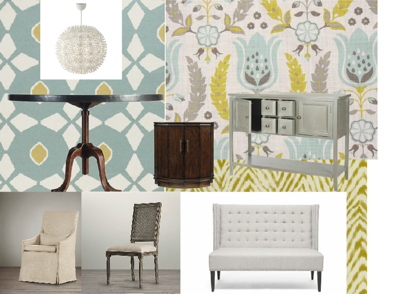
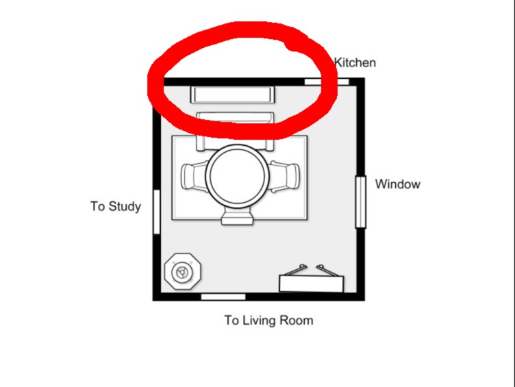
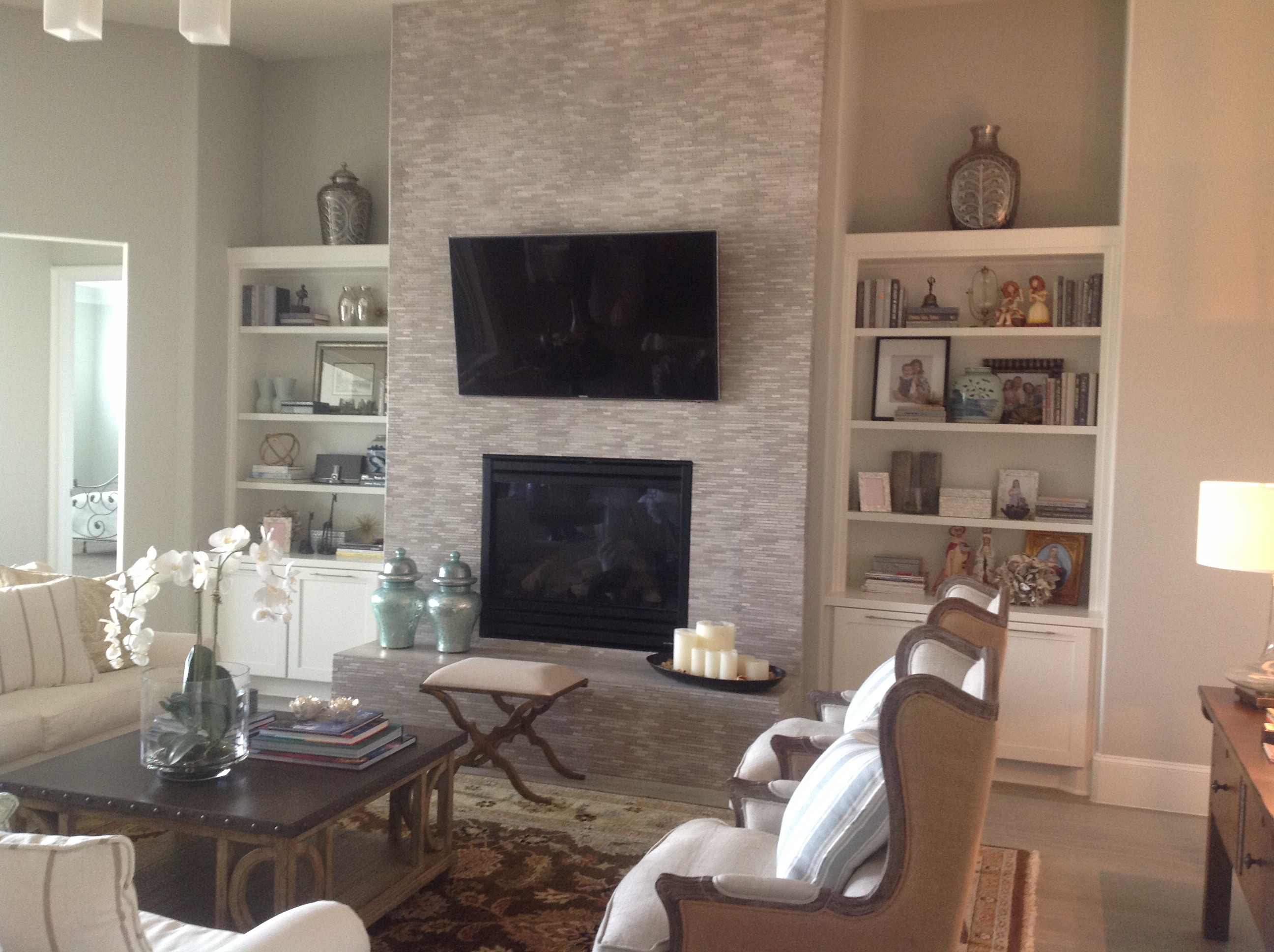
Woohoo!! We are at the half way mark of the One Room Challenge and the Studio Dining Room/Conference Room is starting to take shape. To catch up on the progress so far check out week 1 and week 2.
I managed to get a few things done, despite having a busy week with new clients and projects in progress.
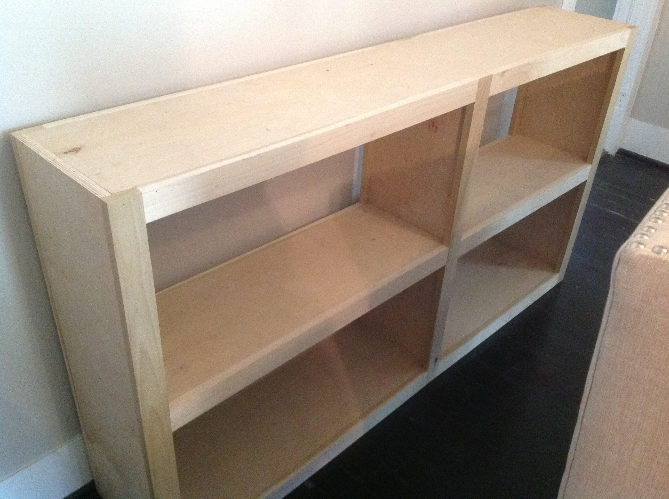
I assembled the blue Safavieh sideboard. It took me about an hour or so. I usually don’t like assembling furniture but this was easy!
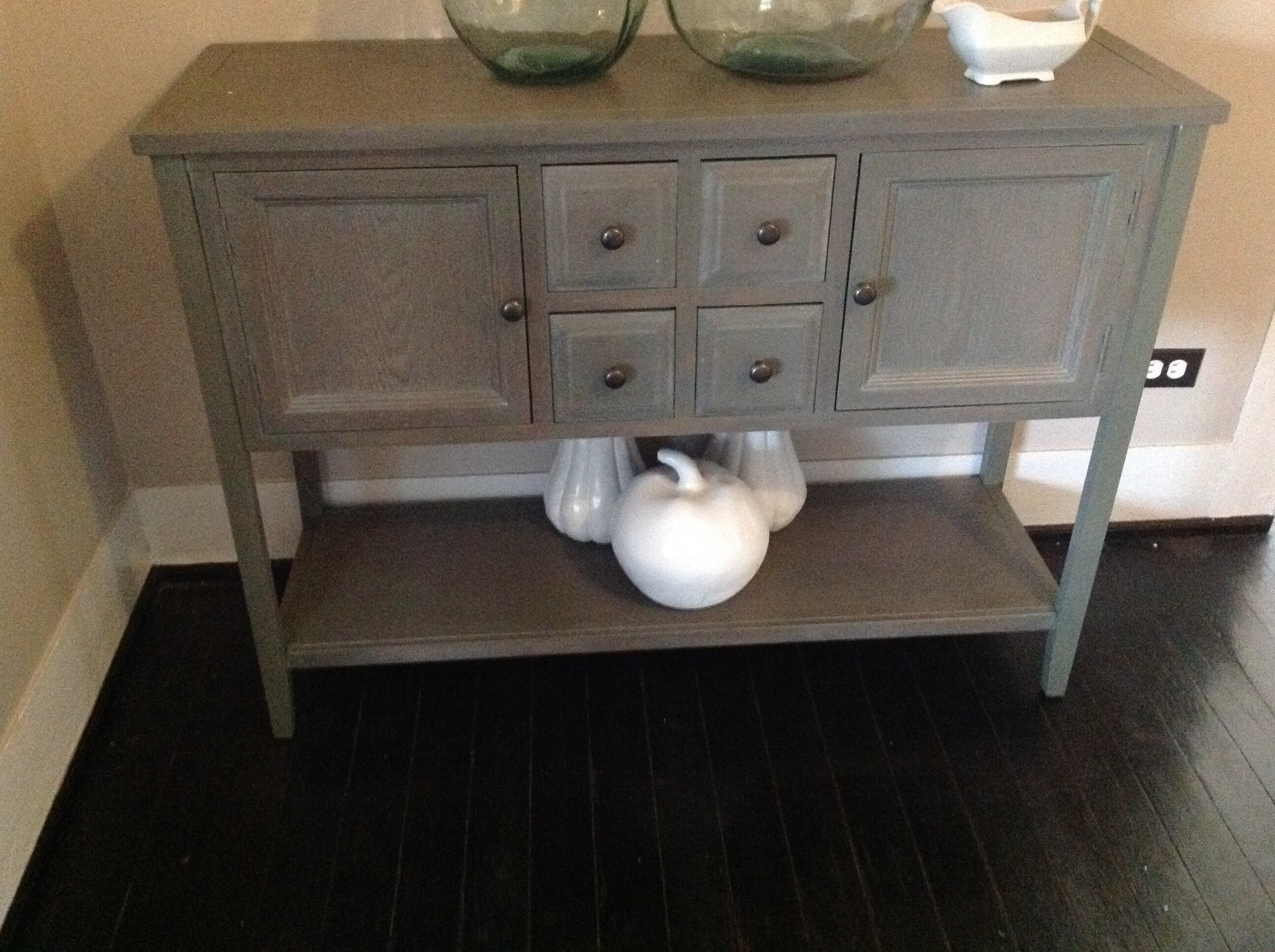
Safavieh Side Board In Studio Dining Room – Casa Vilora Interiors
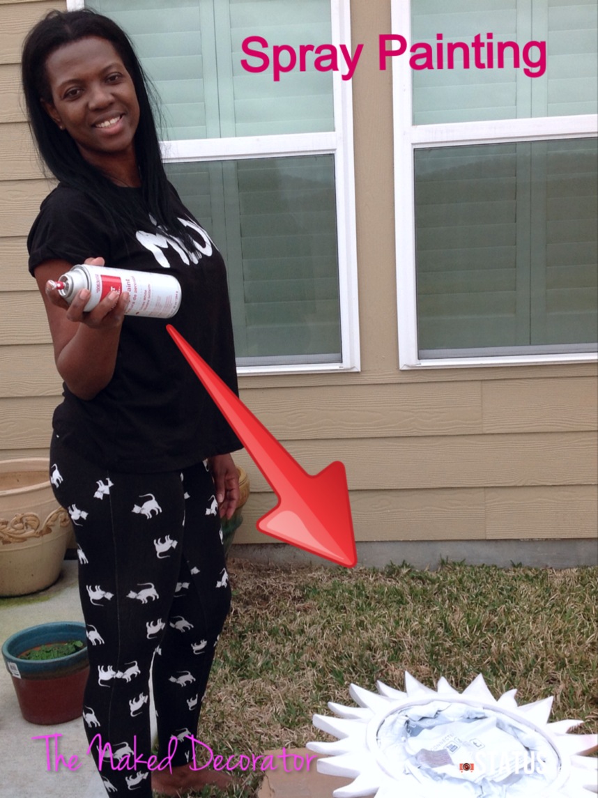
I got a bit of spray painting done.
Source: Casa Vilora Interiors
I got most of the fabrics for custom pillows and box pleat skirt ordered, and I started to hang art and plates on the walls
This is the handy dandy plate hanger that I have been using. They are available on Amazon.
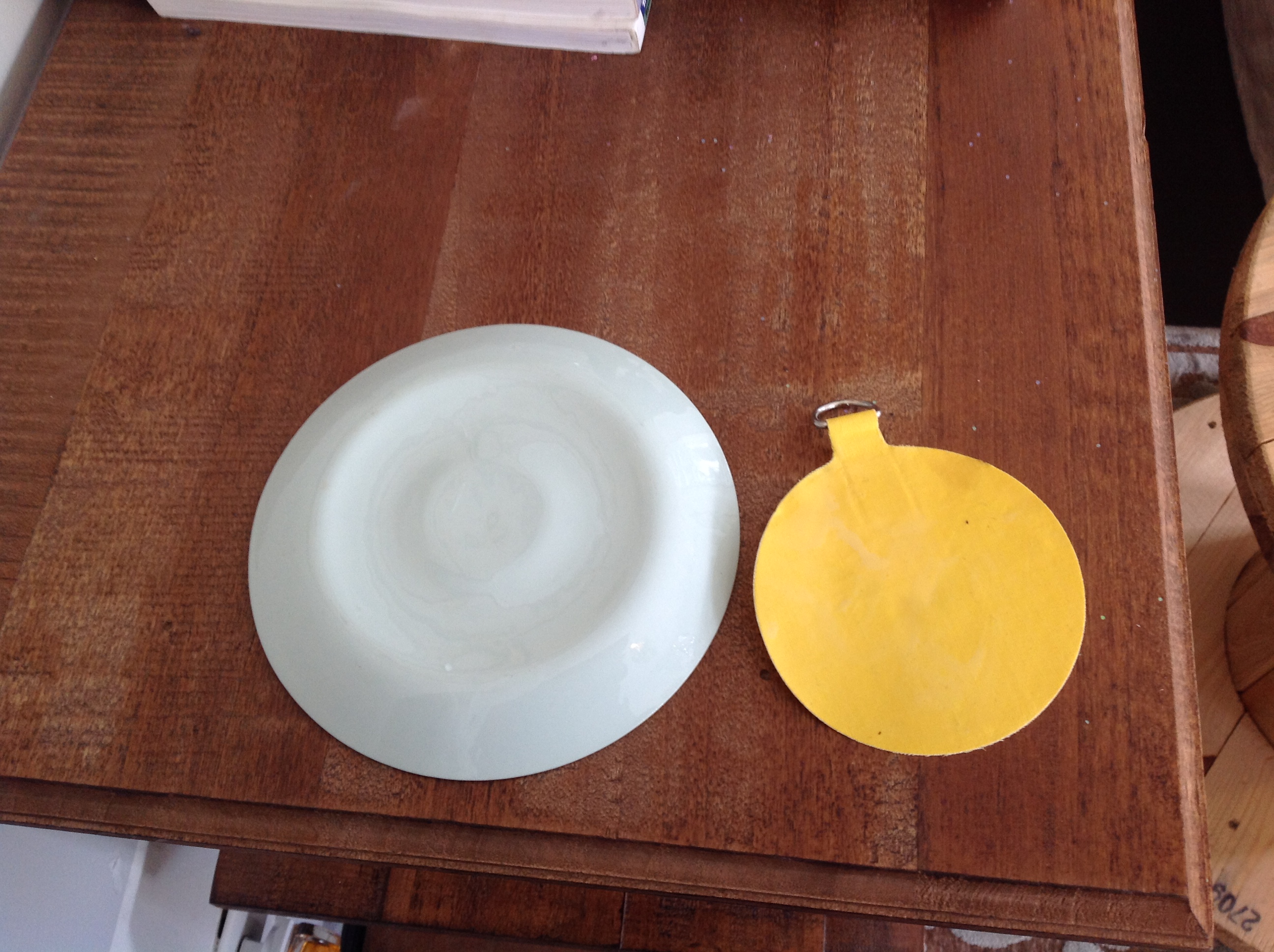
Adhesive Plate Hanging Discs – Casa Vilora Interiors
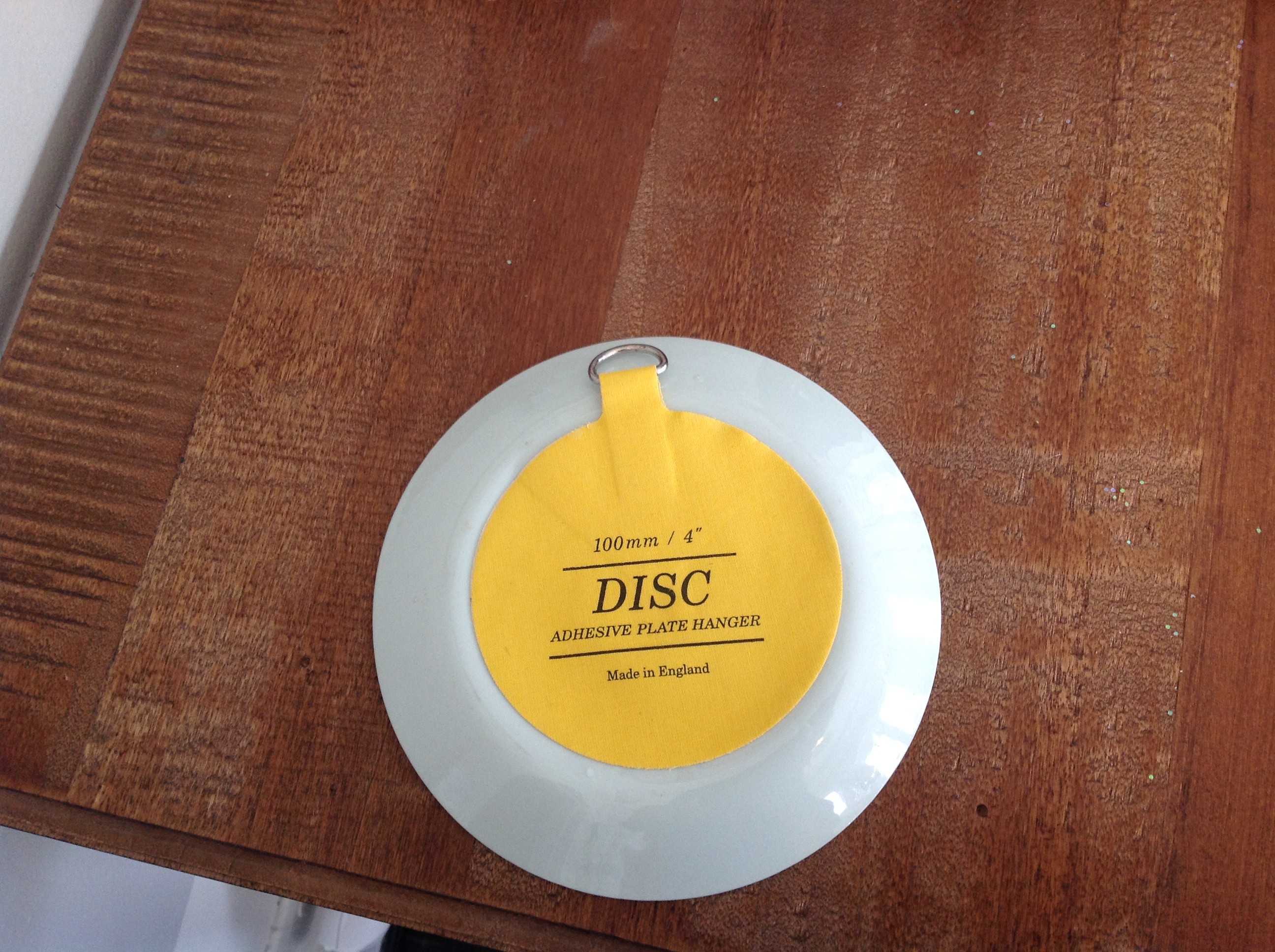
Adhesive Plate Hanging Discs – Casa Vilora Interiors
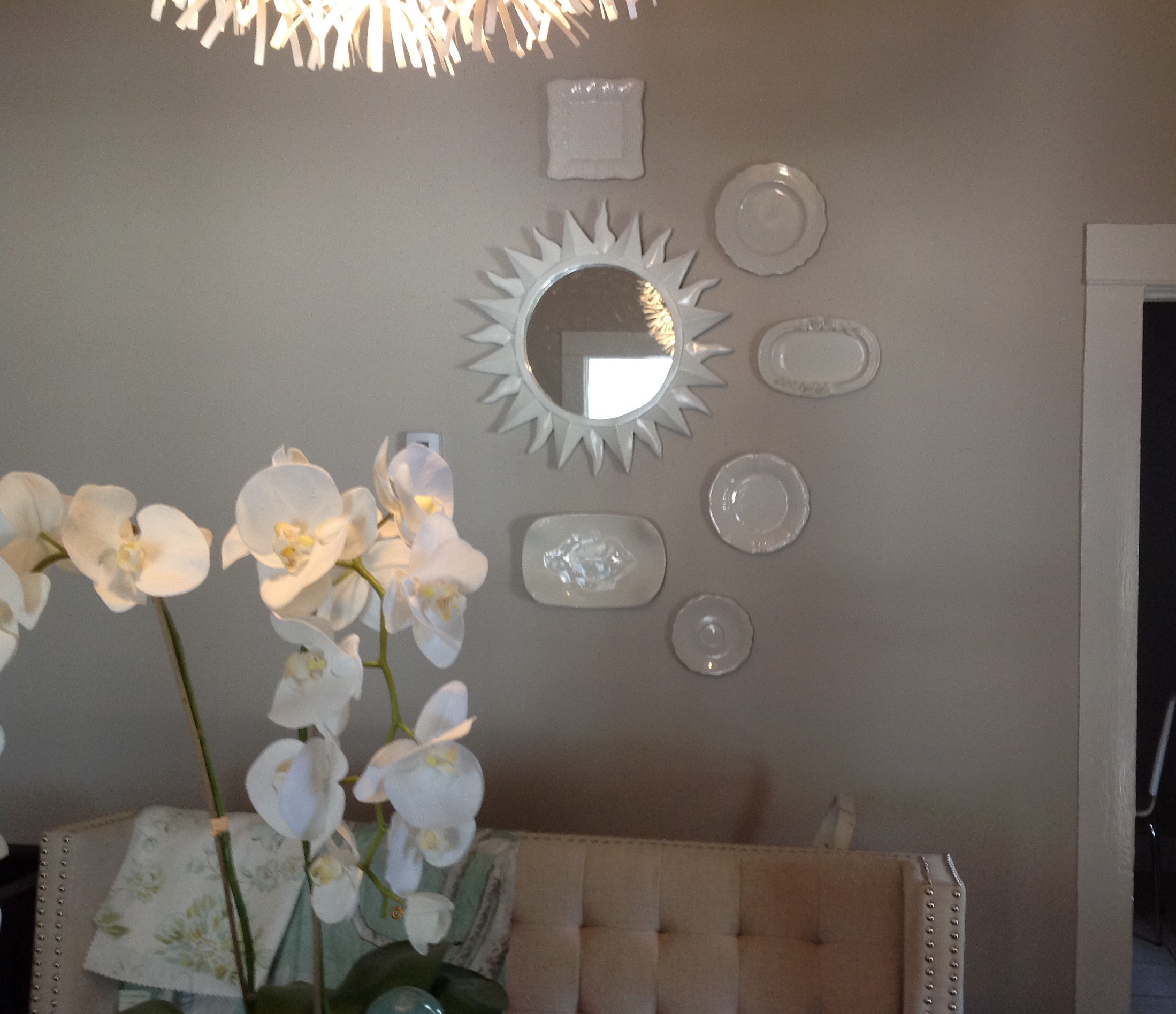
The Beginnings of Plates on Wall in Dining Room – Casa Vilora Interiors
I will be using a few pieces from my budding Ironstone collection. I have only started collecting recently, so it is not quite impressive just yet
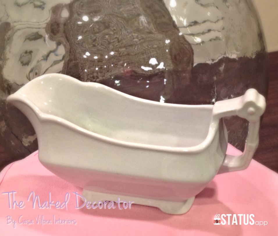
Ironsestone Collection – Casa Vilora Interiors
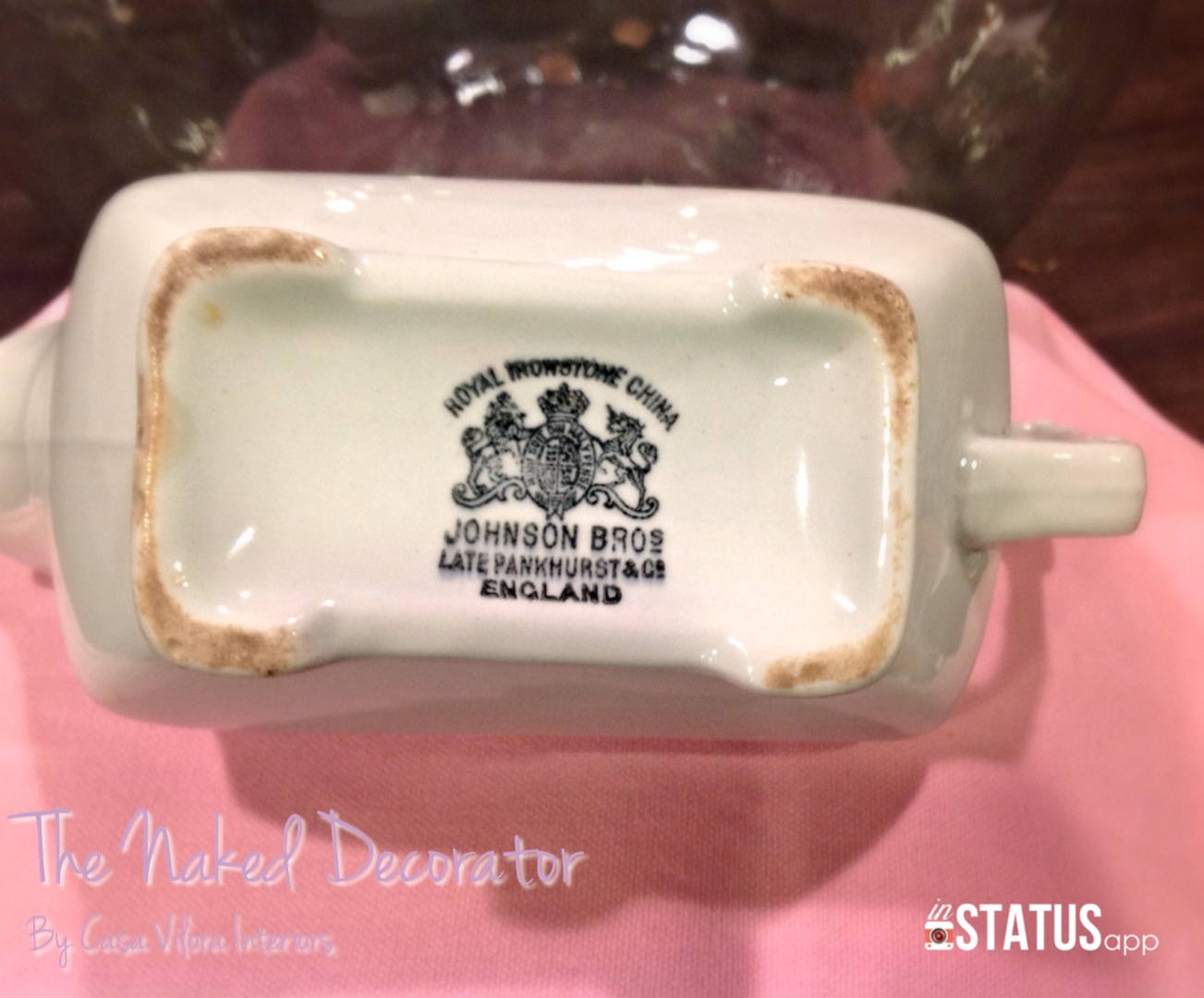
Ironstone Collection – Casa Vilora Interiors
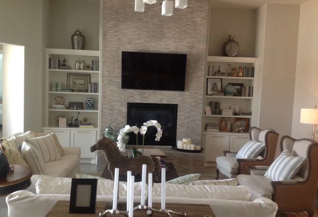
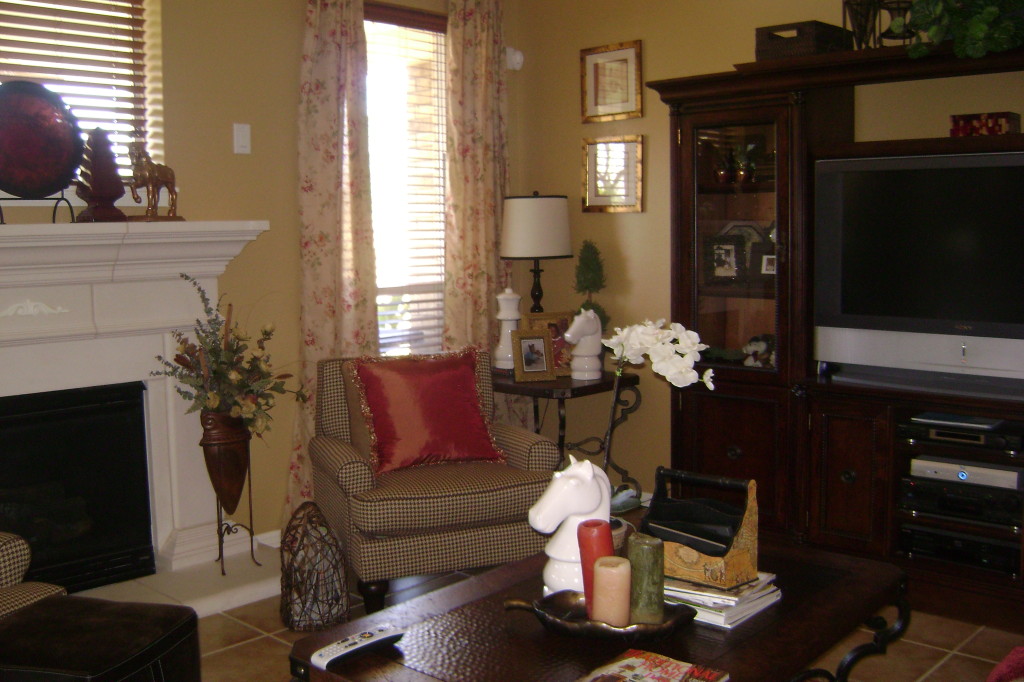
And of course I am still very excited about my recent acquisition…..the Restoration Hardware Vintage Carousel Horse! It will look amazing in the space when it’s all finished. I considered refinishing it in a distressed white, but I decided to keep it as is.
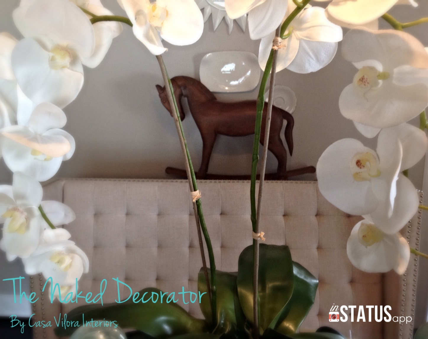
Restoration Hardware Vintage Carousel Horse in Dining Room – Casa Vilora Interiors
This coming week will be spent shopping for the rest of the accessories for the dining room……Now that’s the fun part! And then on toward the finish line!
Keep checking in each Thursday to see how the dining room is shaping up, or follow along anytime by clicking the ORC icon in my side bar (The icon below)

Please check out the other rooms and show them some love. Thanks to our host Linda, from Calling It Home Blog for this exciting adventure!
Thank you for stopping by today!
Wishing you all a terrific Thursday!
Be Inspired!

Veronica Solomon, Casa Vilora Interiors
VeronicaSolomon.com


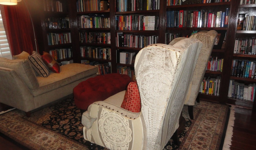

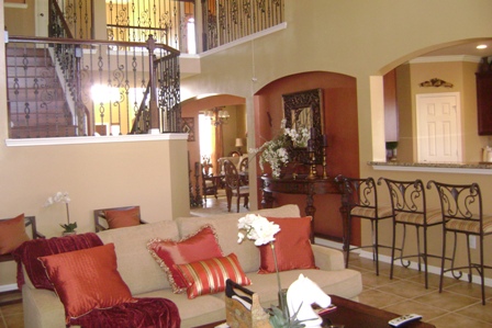
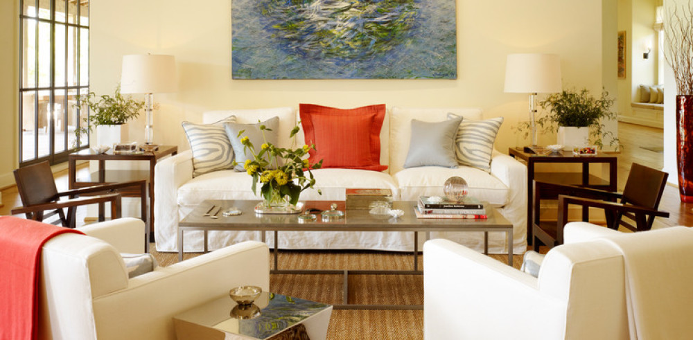
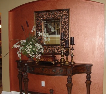 I created this vignette to break up the long hallway from the foyer to the family room. I did that red accent wall myself using a Behr metallic paint.