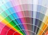
The world’s authority on color, Pantone, has named Radiant Orchid as color of the year for 2014.
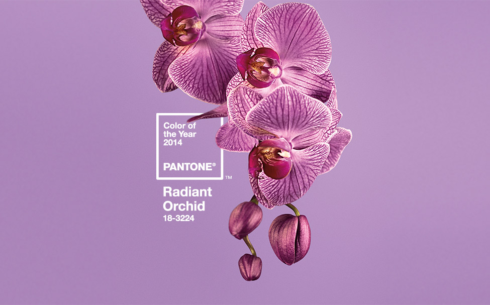
Source: Pantone.com
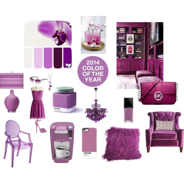
Radiant Orchid has made it’s way in everything from fashion runways to household products, personal goods, and furnishings.
For most people, they don’t necessarily follow color trends that change yearly when it comes to decorating. But here are some great looking examples of how this beautiful color can be used in your home.
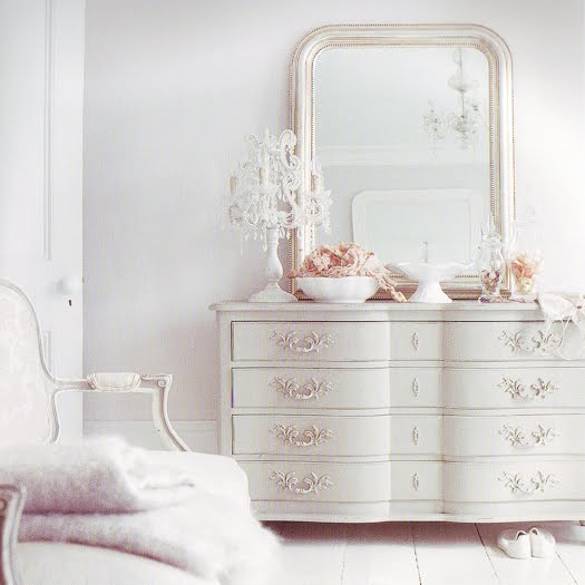
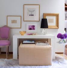
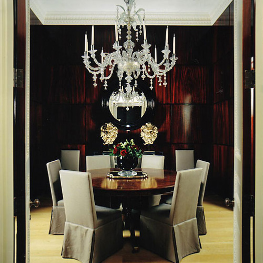
- Use sparingly in non-permanent pieces like pillows or throws. Notice Radiant Orchid is only used in the throw, which can be easily replaced when your taste changes.
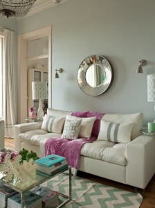
Source: Paperblog
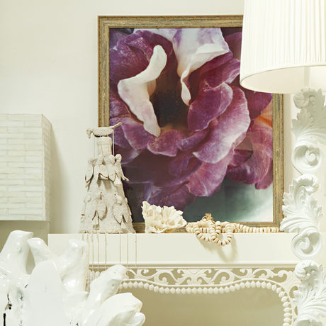
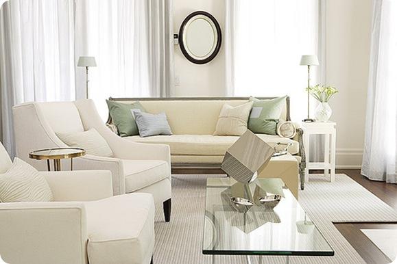
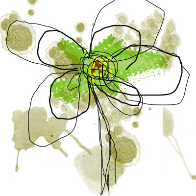
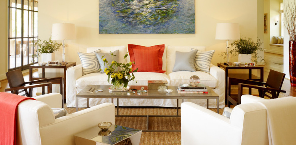
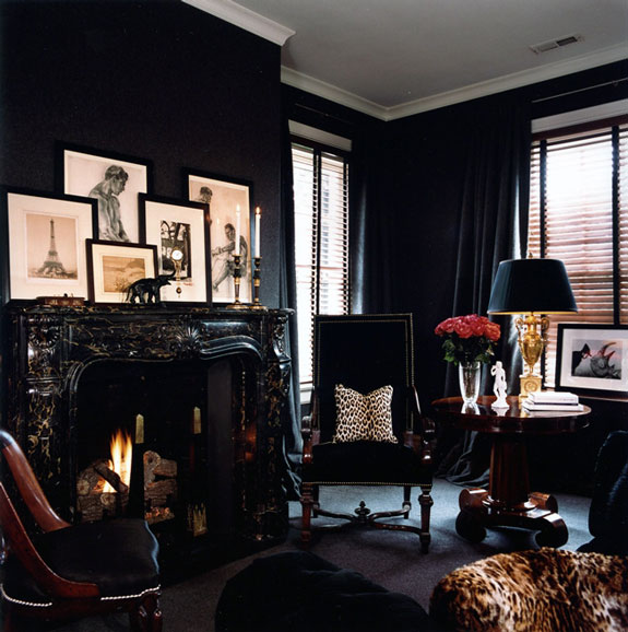
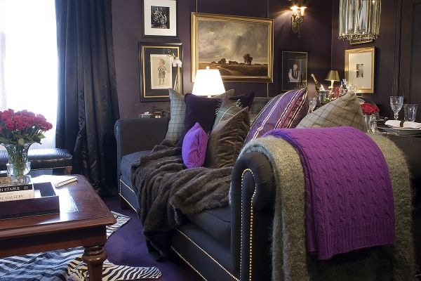
- Go with bold with Radiant Orchid as a strong focal point in an otherwise neutral room. Here, the color is used in a piece of art to add a punch of color to this room.
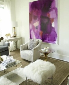
Source: Shop Custom Home
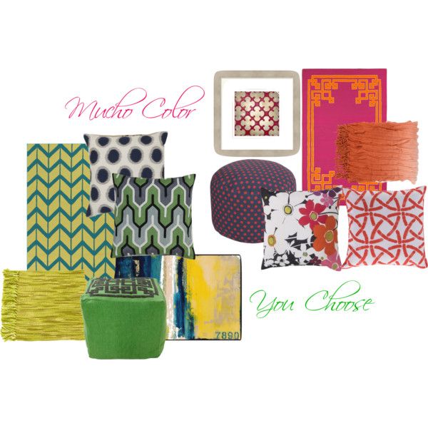
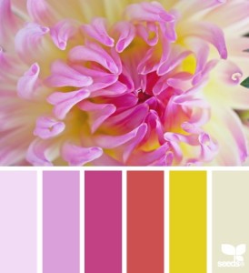
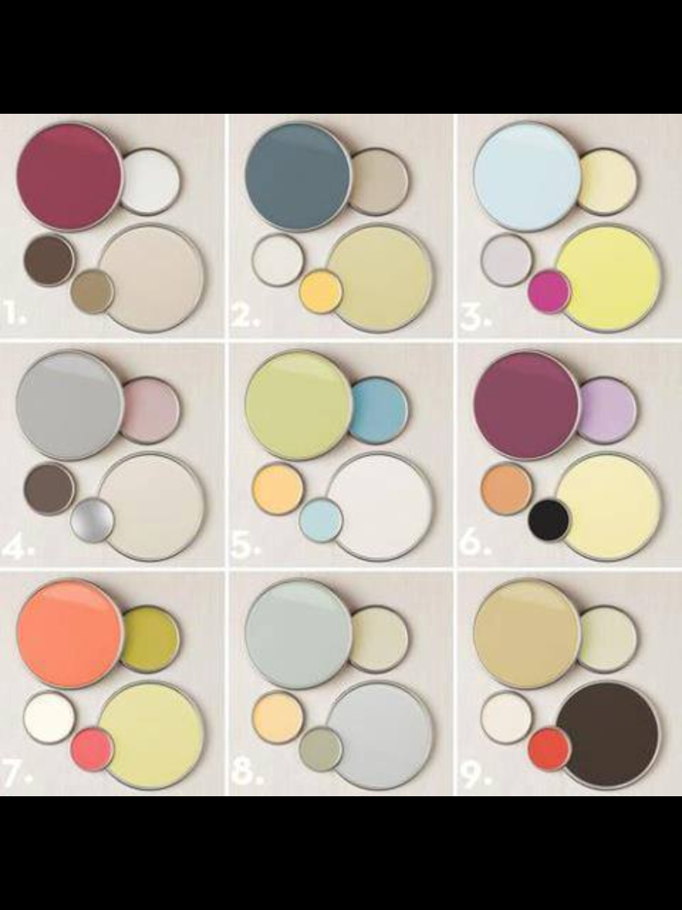
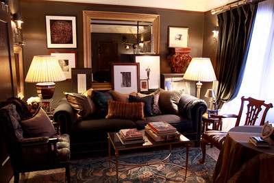
- If you love a lot of color, this a great way to use the color trend without committing one hundred percent to the one color. In this bedroom, various colors are used, all with the same color value, which always makes for a great look.
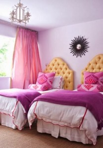
Source: LowellSun Blog
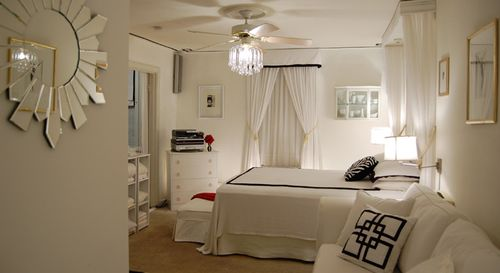
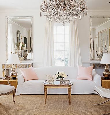
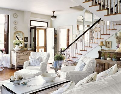
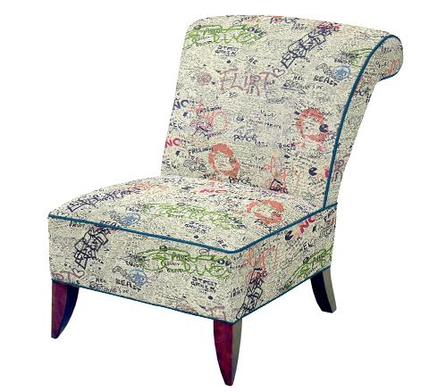
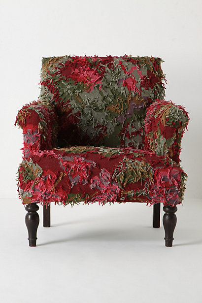
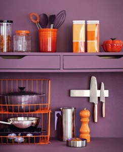
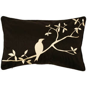
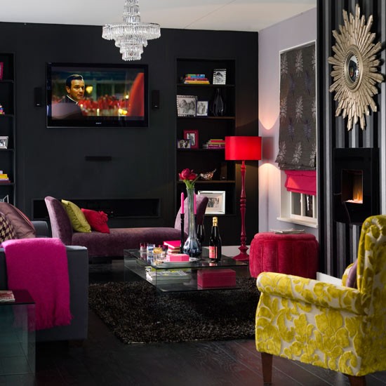
- Radiant Orchid is used here in small but well thought out ways. Upholstering an accent chair in a trendy color is great since it can easily be moved around.
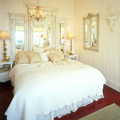
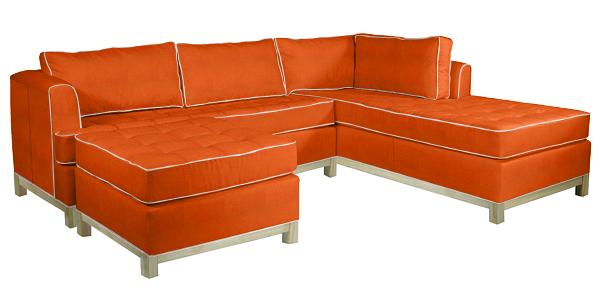
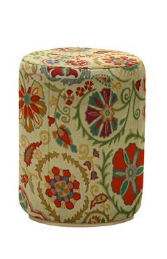
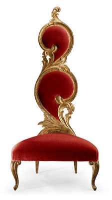
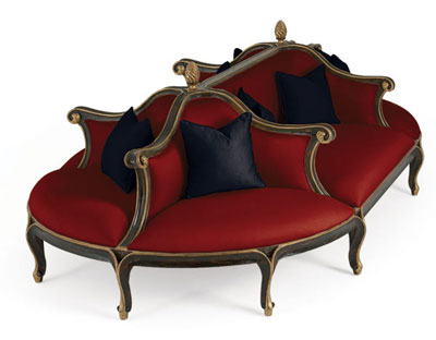
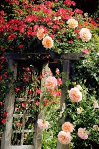
- If Radiant Orchid is your color, then go for it. Use it in bigger, more permanent pieces in if you know that it is a color you will enjoy for years to come.
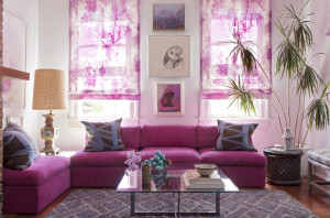
Source: Décor Lounge
Source: Apartment Therapy
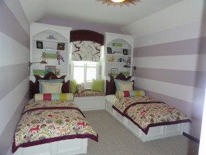
Here is a toddler room I completed a couple of years ago using a version of Radiant Orchid. back then I wasn’t trying to follow the trend, but honoring the request of my clients. This room had to serve a 2 year old boy and 8 month old girl, so it had to be pretty gender neutral. My client loves the orchid tones and wanted to use it in this room.
I started with the walls by painting them in bold horizontal stripes in shades of orchid, and then added the built in beds and bookcases. One of my client’s requests was for as much storage as possible and leaving a bit of floor space for the kids to play. Both beds have drawers underneath, plus a window seat was added for toy storage. A closet system (not shown) was also added to maximize storage .
I designed all the bedding, headboards, window treatments , pillows and seat cushion, and had them fabricated by my seamstress and upholsterer. The roman shade is cordless for safety.
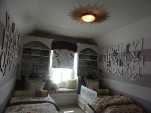
I chose the sunburst light fixture because it does remind me of the sun.
I later purchased two sets of the alphabet (From Going-Ga-Ga.com) for each child’s side of the room. I like these letters over the ones found at craft stores because of all the different fonts, which look a lot more interesting. I spray painted all the letters in white except for the letters that spell each child’s name (Asher and Orli). Their names were painted in blue (on the boy side) and green (on the girl side).The letters were randomly arranged and attached to the wall using heavy duty velcro. My client and I would joke that the kids will be really confused when they learn the alphabet later. Haha! Their names were arranged in the correct order ![]()
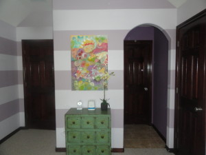
On the opposite side of the room we added a custom oil painting on canvas that we commissioned Duane Cregger, a contemporary artist based in Virginia to paint for the us. I sent him the main fabric in the room (the fabric on the duvets) for inspiration. He did an awesome job. My clients, who once owned an art gallery, are avid collectors and desire only original art for their home
This toddlers’ room started with orchid being the color inspiration and they really love this room.
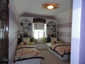
Casa Vilora Interiors Toddler Room Project
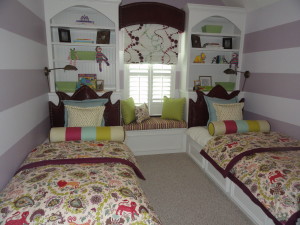
Casa Vilora Interiors Toddler Room Project
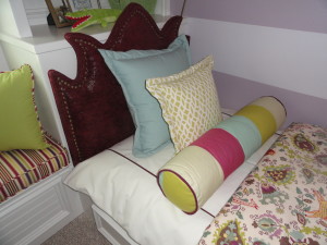
Casa Vilora Interiors Toddler Room Project
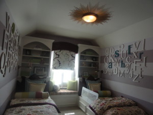
“Alphabet Soup” later added to the walls to add personality for each tiny occupant :-)
Original Oil painted by Duane Cregger
By the way – Here’s the BEFORE shot of the room
Before – Toddler Room Project
Well, what do you think about Radiant Orchid? Will you be using a version of it in your décor this year? How will you use it? Do tell
Remember to keep voting to improve my ranking on Top Mommy Blogs. Simply click the icon below and that will direct you to the homepage which counts as a vote

You can also rate and comment by clicking the Home and Garden category from the menu on the right. You will find me, The Naked Decorator in 1st place for my category (70th overall). Click on the cupcakes to rate and comment. The cupcakes work just like the 5 star rating system. Thanks in advance for your votes.
Be on the look out for upcoming specials through my online store
Happy Monday!
Be Inspired!

Veronica Solomon


.jpg)
.jpg)


.jpg)