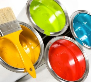
 How many times have you gotten stuck with making a decision about color in your home? Whether it is paint color for the walls, or deciding what color ornaments for the Christmas tree, it’s probably more times than you realize.
Color is one of the key elements of interior design; it has the ability to affect the mood of the users in a space. Several ancient cultures, including the Egyptians and Chinese, practiced chromotherapy, or using colors to heal. Chromotherapy is sometimes referred to as light therapy or colorology and is still used today as a holistic or alternative treatment. Color is serious business! It can make or break a design scheme.
- Red was used to stimulate the body and mind and to increase circulation.
- Yellow was thought to stimulate the nerves and purify the body.
- Orange was used to heal the lungs and to increase energy levels.
- Indigo shades were thought to alleviate skin problems.
- Blue was believed to soothe illnesses and treat pain.
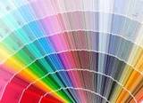
Most people know what colors they like and ones they don’t, but when it comes to applying those colors in a room’s décor, it becomes an overwhelming experience. As an Interior Decorator, there are different strategies I use in my design practice to choose colors for my clients. A few basic ones are:
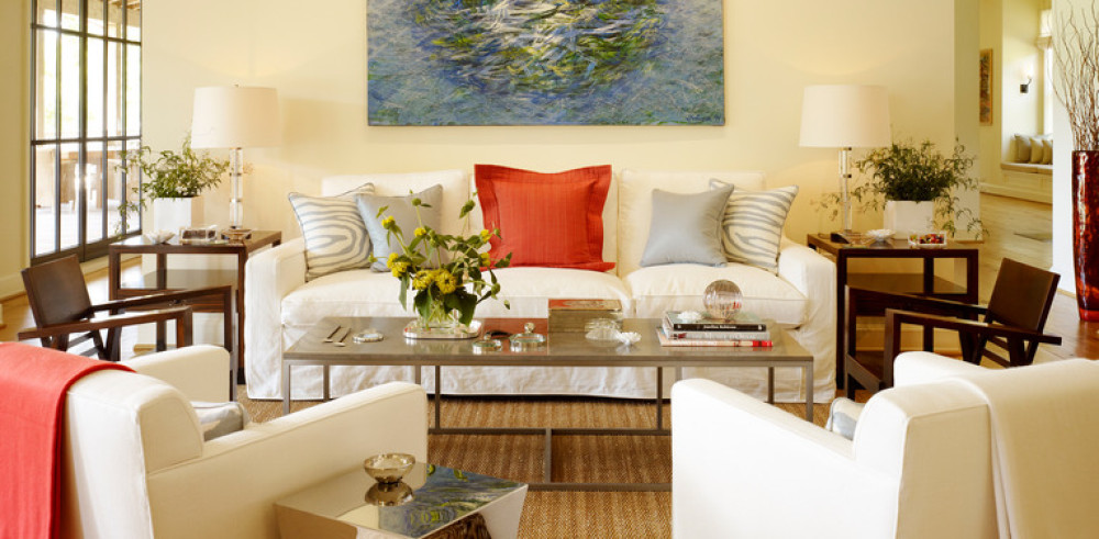
- Finding color Inspiration in the fabrics being used in the room.
- Finding color Inspiration in the area rug being used in the room
- Finding color Inspiration in the artwork or wallpaper
- Using paint store displays or paint store websites for inspiration
- Looking to Nature for inspiration.
- Taking a cue from current color trends in interior design and fashion
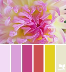
Photo: Design Seeds
Looking to nature for color inspiration is easier than you may think. Design Seeds is one online resource that provides color inspiration from nature in a method that’s easy to use for most consumers. while the colors have no names, nor correlate with paint store brands, they definitely help to point you in the right direction. Here are some other examples:
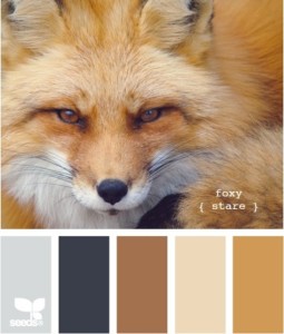
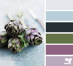
Photo: Design Seeds
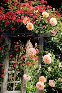
 Look at the world around you, starting in your own backyard and see the beauty and colors of nature, and bring those colors inside. Maybe it’s the rose bush in your neighbor’s yard
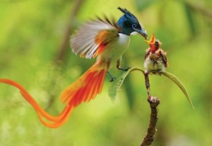
 Or the beautiful bird that keeps gracing you with her presence everyday….
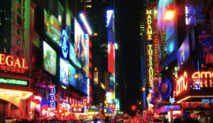
Even if you live in the big city, and maybe don’t get to see a whole lot of nature’s beauty, there is still color inspiration waiting to be discovered
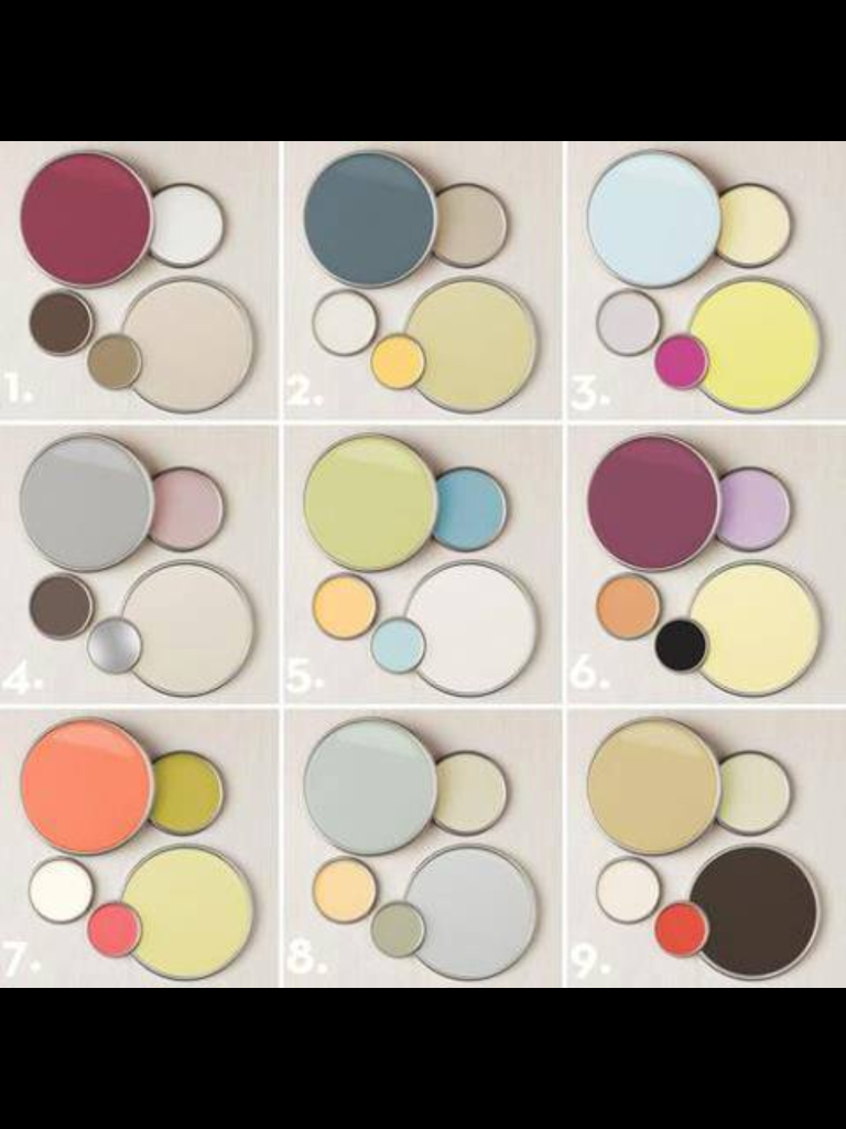
Here I have included a series of color palettes; take a look and see which palette feels more like you. Leave a comment below with the number of the palette that most inspires you and why
If all those methods still seem a bit overwhelming for you, call in the professionals. I offer hourly color consultations to clients in the Houston area. You can contact me for more information.
Hope you were inspired to go forth and pick colors! ![]()
And now, the moment you’ve all been waiting for …….announcing the winner of my blog contest “Name The New Mascot For No Naked Windows“!!! But before I get to the winner, I would first like to reveal the answer to my latest blog post “What The Heck Is It“, where you had an opportunity to reveal your inner designer, by guessing the name and use of the special product pictured below.

A couple of folks got it right…Congratulations to Jennifer Clay and Sonya!!! ![]()
![]()
It is called a corner adapter or elbow and it is used to attached two curtain rods that meet in a corner for a seamless, more finished look. Much like the human elbow, it is flexible enough to follow different angles smoothly.
Ok, now for the winner of our blog contest for coming up with a great name for the new Mascot for No Naked Windows. Here again is a picture of the little guy or girl.
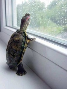
Photo: Secret Garden FaceBook Page
First I would like to thank everyone who participated. There were so many great names, I had a hard time picking a winner! My beautiful children stepped in to help, so here goes!!!

The name of our cute little GIRL is SHELLY the turtle, chosen by Rob Manea and his adorable 8 year old daughter!!! Congratulations guys!!! You did a great job naming the new mascot for No Naked Windows.
For your fabulous prize, you get to choose between these two pillows!!!!
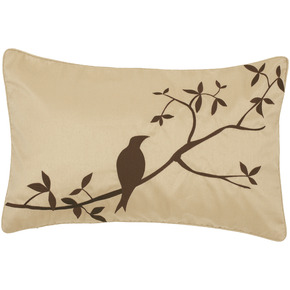
13×20 Pillow in Brown/Tan
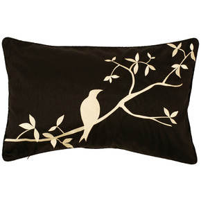
13×20 Pillow In Black/Ivory
Rob, please send me an email to claim your prize. Please include your choice of pillows and the address where I can send it. Congratulations again!!!
Ok, that’s all for today folks. Please watch for more contests in the near future!
Please comment and share! ![]()
Have a fabulous Monday!
Be Inspired!

Wanna say, Color Are the part of life…
Life is never imagine without color, my room is painted by 5 color, I love color too much…
That was an inspiring article.
I am about to move in a new home, and it gave me lots of ideas on how to choose colors for my walls
Thanks Carolin and congrats on your move! I’m in the middle of moving myself! Best wishes to you
Woo Hoo!! Colors have got to be the hardest part of decorating the room for us, since we can never agree..
The right colors can show your personality, preferences, and general disposition. Colors make our world more fun and unique, and can be powerfully used to persuade and move. Thanks for sharing Veronica, great article!!!
Oohh..that’s called a corner adapter.. learn a new thing everyday. Yes..there are many colors in nature which complement each other.. great resource to get to know which colors to use from nature.
I love this post! Color is so important, because it sets the mood and the feel of the room. I prefer earth tones, and I liked palettes 1 and 2.
I really like the peach and green of #7. It’s so true that colors change the feel and atmosphere of a room. And, it’s an easy way to change a room without spending a lot of money.
This is a great article especially in my industry to help clients that are purchasing a home get ideas!
WHEW!! Veronica, I don’t have to tell you about the importance of color in nature in my life!! I always follow nature because, well, I work with it every day! Even after all these years I still marvel at how well things go together (even when I think they won’t) If they work in nature. Thanks for reminding people to simply look outside and see the beauty, then bring it in!!
I like #2 and #3. I am working on bringing some color into my house. Thanks for this post on color!
#7 Is my favorite because it has the color closest to orange. My living room is pumpkin orange and I love it!
I should send you a pic of my room and see what you come up with! All my walls are creme and blah!
Yeah, color selection is most important for interior decoration.
I like pallets number 3
God is good!
I truly love this site and the fresh ideas you have. Well, well done. (Plus, if the winner doesn’t come for the pillow, I’ll take No. 2:)
Having the colors with which you are comfortable is really important! Thanks for all the great information!
Colour choices are always a challenge – my grown kids help a lot as they say I have made bad choices !! I do love my burgundy bedroom and find it very restful.. I tend to favour dark walls as long as there is a lot of light..
Colors are very important and you have such a good I for that Veronica.
ture!!
Great article….I’m loving the color combo of #5 in your collage.
You make it look so easy to choose a color…
Thank you all for your wonderful comments
I really like #6. I have always liked purple colors. I was actually thinking about painting my bathroom and was having problems deciding what color to choose. I think I will choose a blue color since it helps with pain and healing.